During my first month at TinkerLabs, Vaibhavi & Abhi approached me with an interesting challenge: their team had been working on a project with HP and needed to communicate how instruction from senior members of the management gets lost in the sea of employees below them in the hierarchical ladder.
They had managed to procure data on the hierarchical chain and were trying different visualisations to communicate the scale.
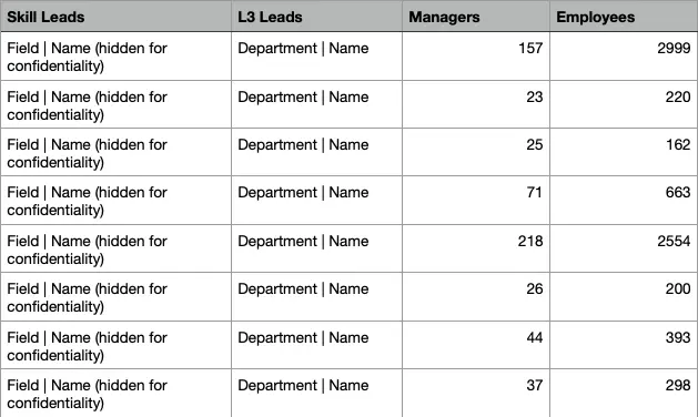
The data table they presented. The organisational hierarchy moves from left to right.
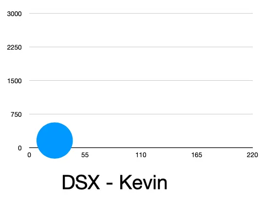
A visualisation that Abhi had tried but was unhappy with.
I wrote a custom program for them where they could input the names of the managers & leads and show how information is disseminated to the employees under them. You can play around with the program here.

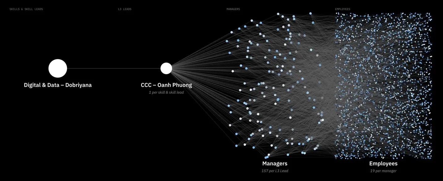
One visualisation to show a chain of instruction being passed on from heads to employees.
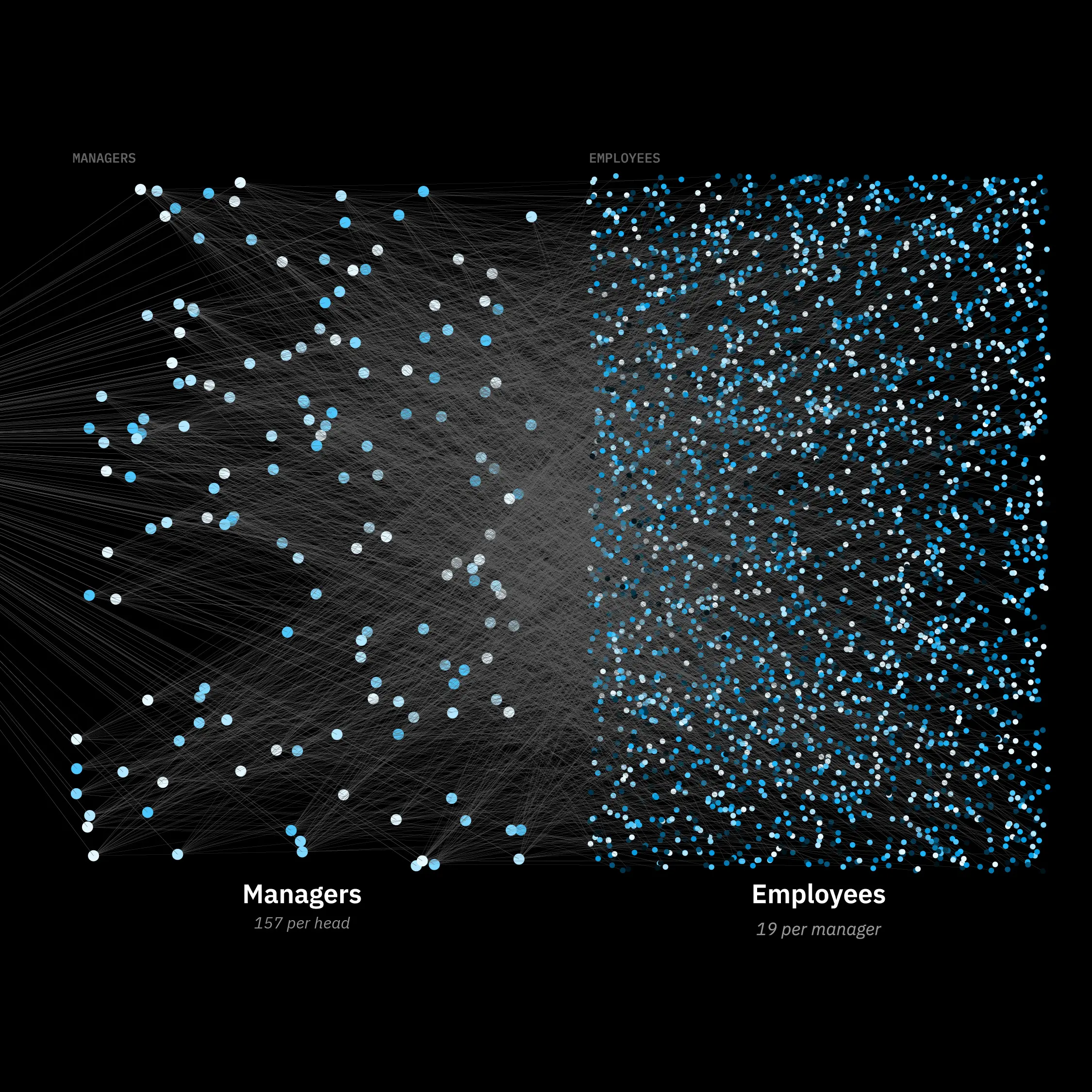
A zoomed in screenshot. The goal, as Vaibhavi said, was to clearly communicate the "mess".
The final visual that the team used to present, giving the stakeholders a macro view of their organisation.