Deconstructing the design of this website
Self-directed
HTML, CSS, JS & p5.js
By the time I graduated in 2022, there emerged a strong need for me to document & archive my work. I had three reasons: (a) to easily share work with people, (b) to have a digital archive of my journey, and (c) to better understand my process by writing about it.
Throughout 2022-2023, I read religiously for ~30 minutes everyday. This included papers, books, blogs, articles or pretty much anything that tickled my fancy. By doing this, I came across several personal websites that acted as inspiration for my own. Here are all the websites that (I think) influenced the design of this website:
Gwern.net
- Effective usage of typography
- Creative confidence of not shying away from their personal style
- Personality coming through: if someone writes long-form articles, why should they keep their website content short? (opposing what we're taught in design school)
- Forced me to question who I was and wanted to be on the internet
Alex Miller’s Personal Website
- Clean, simple layout
- Colour scheme
- Used his idea of project tags on my own website

Kevin Feng's Website
- Saw Atkinson Hyperlegible for the first time (which became the primary typeface for this portfolio)
- Clean layout, 3-colours & proportional type sizes
Oimo's Website
- One of the coolest websites I’ve ever seen
- The idea of having interactive sketches on the website itself
- Creative liberty
Ralph Ammer's Blog
- Using hand-drawn sketches to explain text (I still have to work towards incorporating this)
- Using GIFs as covers
Gyan's Website
- Using a static site generator (which I didn’t end up using)
- A ‘Now’ page (WIP for my own)
- Updating blogs
- Birthday blogs
- Personal style
Matthew Storm's Website
- Fantastic design
- Clean, driven by content
Yehwang Song’s Website
- Confident personal style
- Sticking to her narrative of being an “anti-friendly, nonuser centric and unconventional web designer.”
- Unique way to browse through all pages in the website (like on my landing page)
To be in full control of my space on the internet, I developed my website from scratch by using HTML, CSS & JavaScript. Fun fact: I had never developed a website before.
I wanted the website to change based on the width of the device that it was being viewed on. The entire website was, therefore, built to be responsive (mostly by using CSS flexbox). Furthermore, type sizes were chosen to be fluid, i.e dependent on the width of the device.
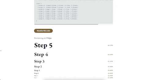
Type sizes changing with the device's width. Tool used: Utopia Fluid Type Scale Calculator.
Since a lot of the content would be words, careful consideration was given to the typography. Atkinson Hyperlegible is used for longform content since the typeface was developed specifically to improve comprehension. Victor Mono is the second typeface that is used, to include a programming font & add a little bit of flair with the unique italic character set.
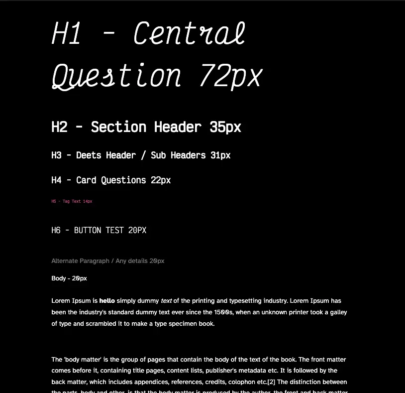
A screenshot of an initial typography test.
I knew that I wanted a dark themed website, because it's a little more comfortable for me to read in. While I do know that other people may have different preferences, I stuck to the idea of a dark theme because it resonates better with my character. White seems too bright.
Initially, I went with a straight rgb (0, 0, 0) for black and rgb (255, 255, 255) for white but later shifted to the Flexoki colour scheme developed by Steph Ango. It seemed like a well-balanced, tested and extensive colour scheme.
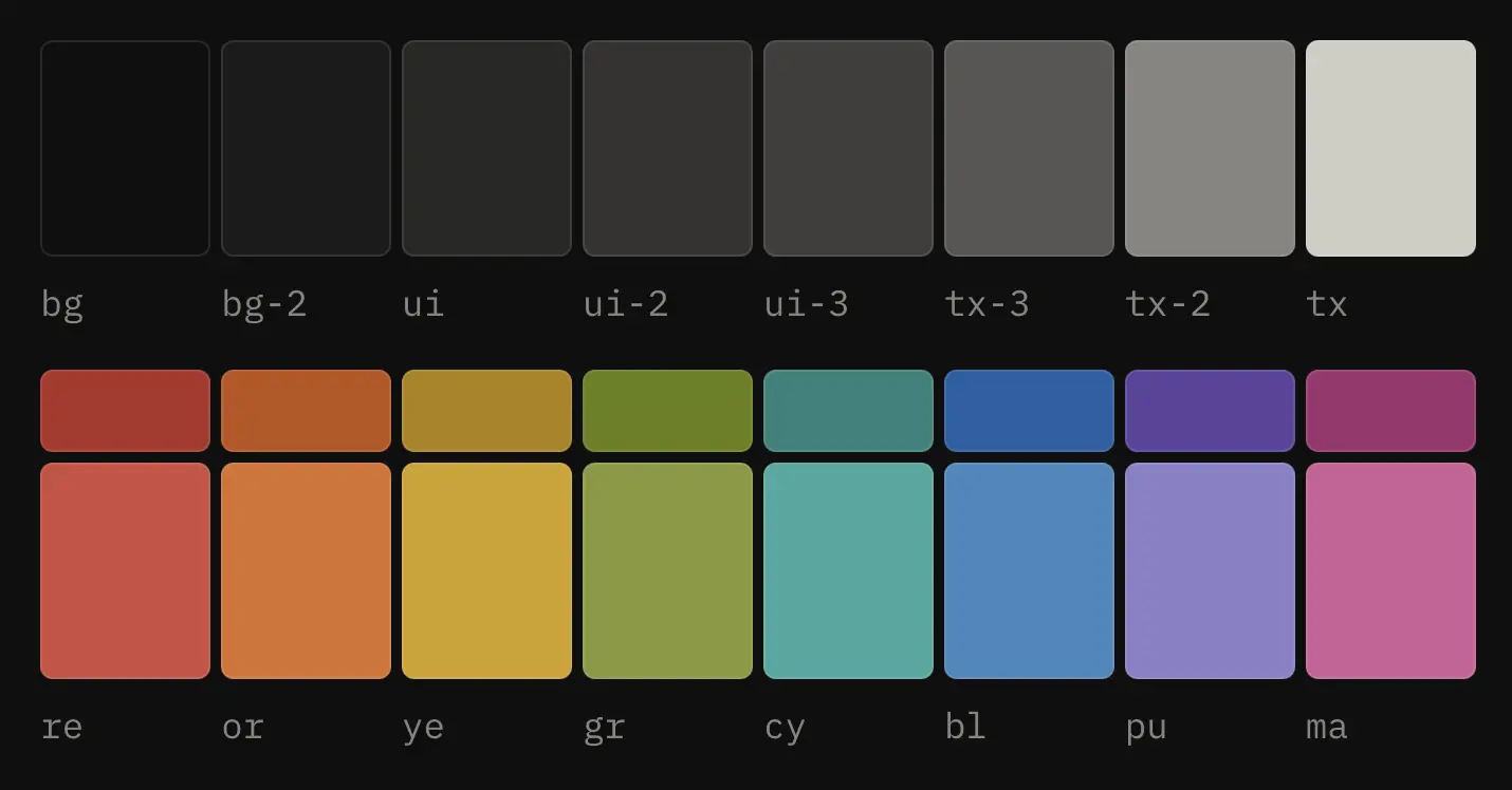
The Flexoki dark theme; credits – Steph Ango.
Each page has been designed with strong intent. The landing page is meant to be a clear digital brain, for people to choose a section of it to go further. Initially, I had a piece of text that would break into fragments if a person did not interact with the website. However, it was Anusheel who pointed out that the person viewing should be sold in the first glance. Shaunaq had suggested to include a grid of videos to show the breadth of my experimentation. That's what I resorted to.
The first lander with text breaking into particles if a person doesn't interact with the page.
Current landing page with a grid of videos. Interestingly, it's a single 5-second loop that is playing in a background and not individual videos, to save the viewer's bandwidth.
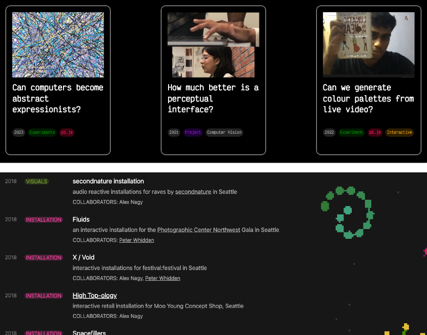
Once people select the section that they want to go to, everything was designed to be geared towards their search. For example, the work page features an expansive list of the different kinds of work that I do, segregated with relevant tags.
A scroll of the work page.
Case studies were especially important to me. I am a person who likes to read & write about the process because I've found myself frustrated a number of times trying to understand how or why people did things that they did. The pages have easily scannable section headers (since they break the larger grid), for viewers to quickly find what they're looking for.
Scannable section heads.
Additionally, wherever necessary, code / underlying logic is also explained for people to build on the work I did (should they ever wish to).
Code snippets for In Between Life & Death.
Another part that is very crucial to me when I look at other people's work is to understand how they got there, and what their journey looked like. Therefore, the story page on this website is a detailed summary of my journey to where I am today.
This website has been majorly made with HTML & CSS, with a splash of Javascript for all the interactive stuff. I am by no means a proficient HTML / CSS person and the code for this website is definitely not efficient. I mainly used a container for each element on the screen (that responds to screen width) and styled the children of each parent element according to the way I wanted it in a master CSS file.
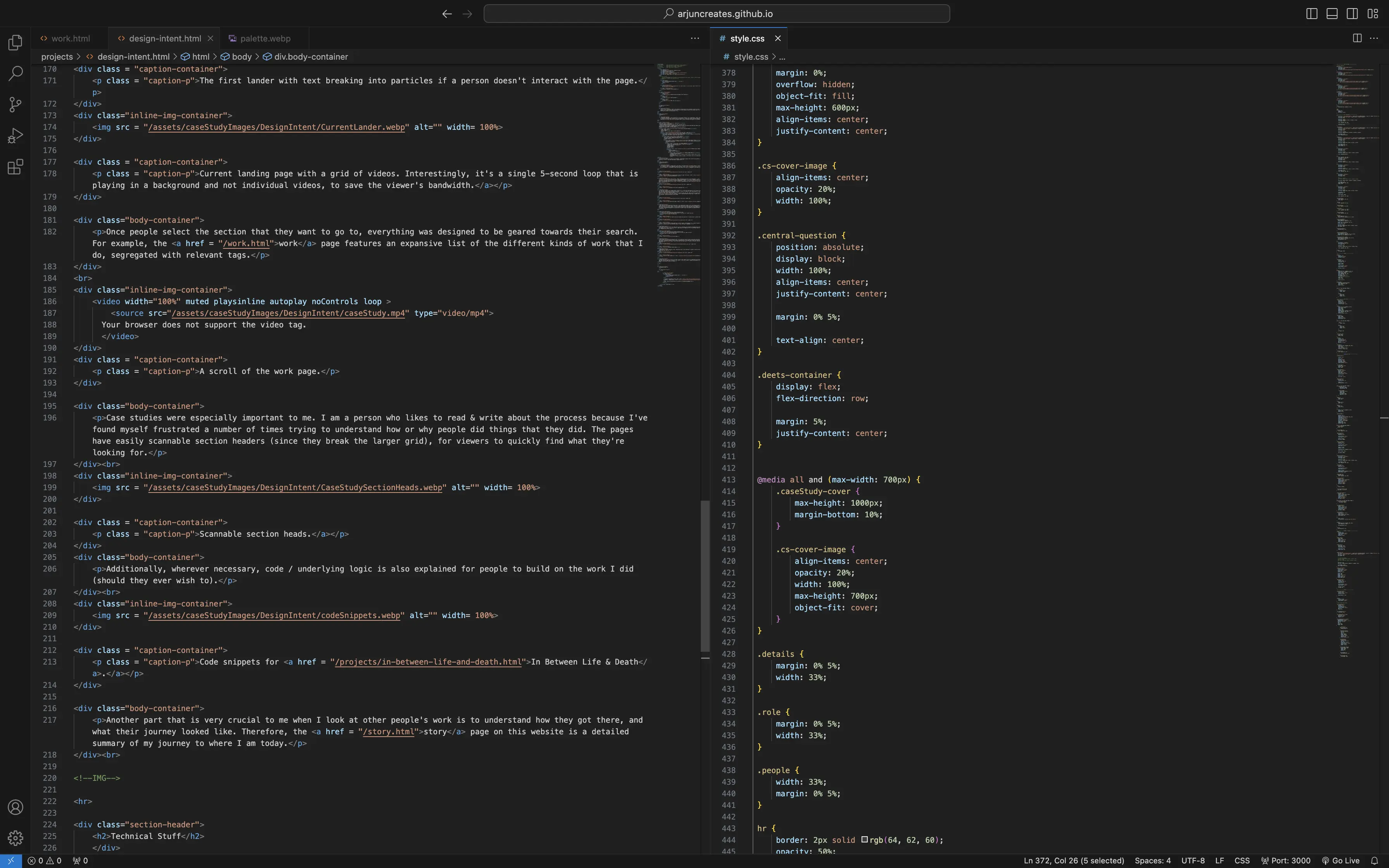
The HTML & CSS file for the very page you're seeing right now.
I knew that my website would be extremely media heavy, which is why I had to optimise my media a little bit. Every single image on this website was converted to a WebP file (for reducing size and loading it faster) and most big videos are embedded from YouTube (to reduce load time).