Speculative visions of the Earth crowd-sourced from the youth of Bengaluru, presented at the Hot & Bothered Youth Symposium, 2022
Lead designer & co-facilitator
Team: Jyotsna, Snehaja & Samyukta
Mentors: Vasudha & Madhushree
As part of the Xperimenters programme at Science Gallery Bengaluru, the four-person cohort was expected to co-create a project to be presented at the annual Science Gallery Youth Symposium. The 2022 edition was titled Hot & Bothered and aimed to bring young people together from around the world to foster action for climate justice.
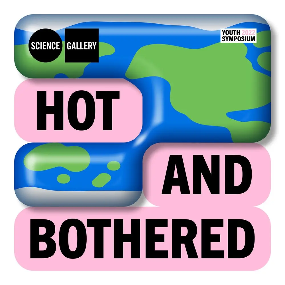
The event logo. Credits: Science Gallery International.
The four of us decided to steer away from the scientific lens of dissecting the climate situation and attempted to look at its impact on the youth of Bengaluru, the city we lived in at the time. What does climate change mean to the people around us and what kind of feelings does the anticipation of the future give rise to?
Heavily inspired by the work of Guerilla Science, we fell in love with the idea of crowdsourcing data. Jargon-heavy climate debates aside, we simply wondered what young people thought the Earth would look like in the future, if we continue to live the way we do. Armed with hundreds of post-its, a couple dozen markers and a somewhat intriguing visual identity, we set out to try and find out the speculative visions of the Earth as envisioned by the young people of Bengaluru, India.
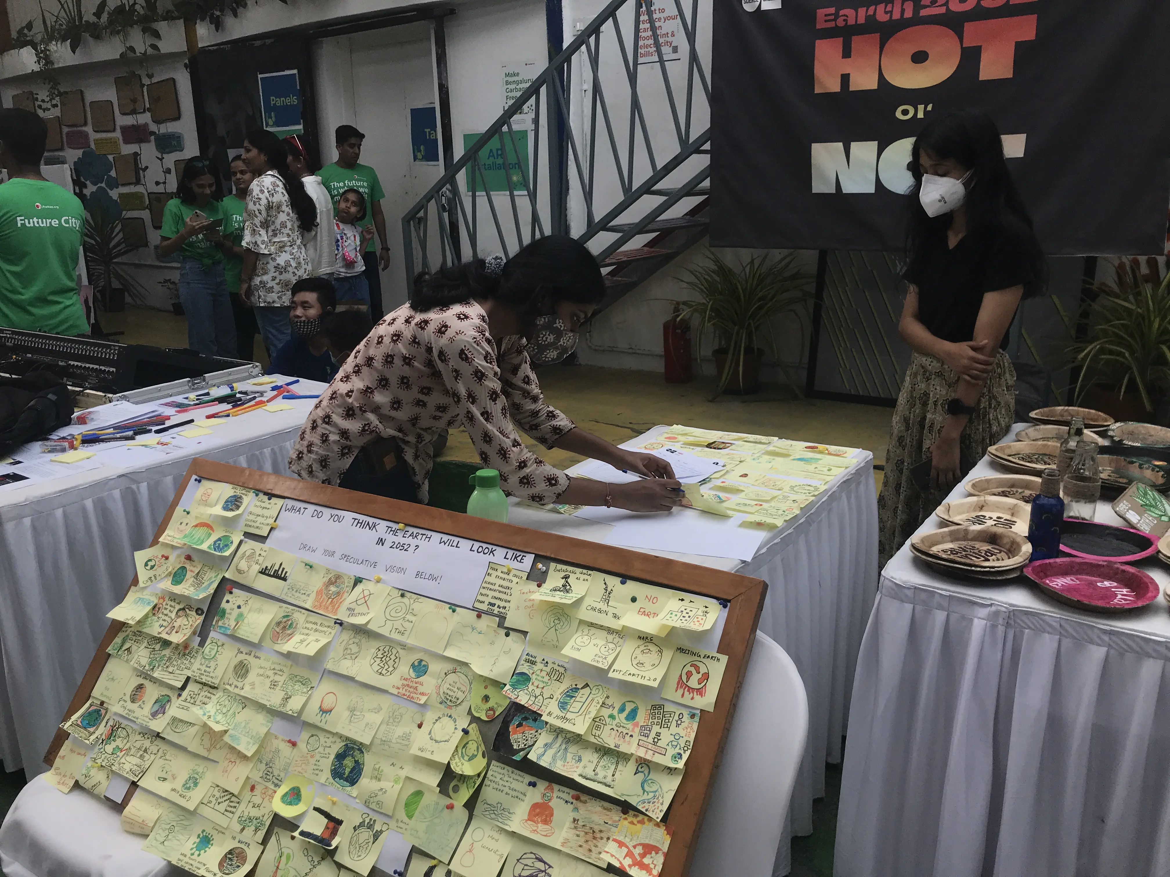
Snehaja & Jyotsna arrange the visualisations during one of the days.
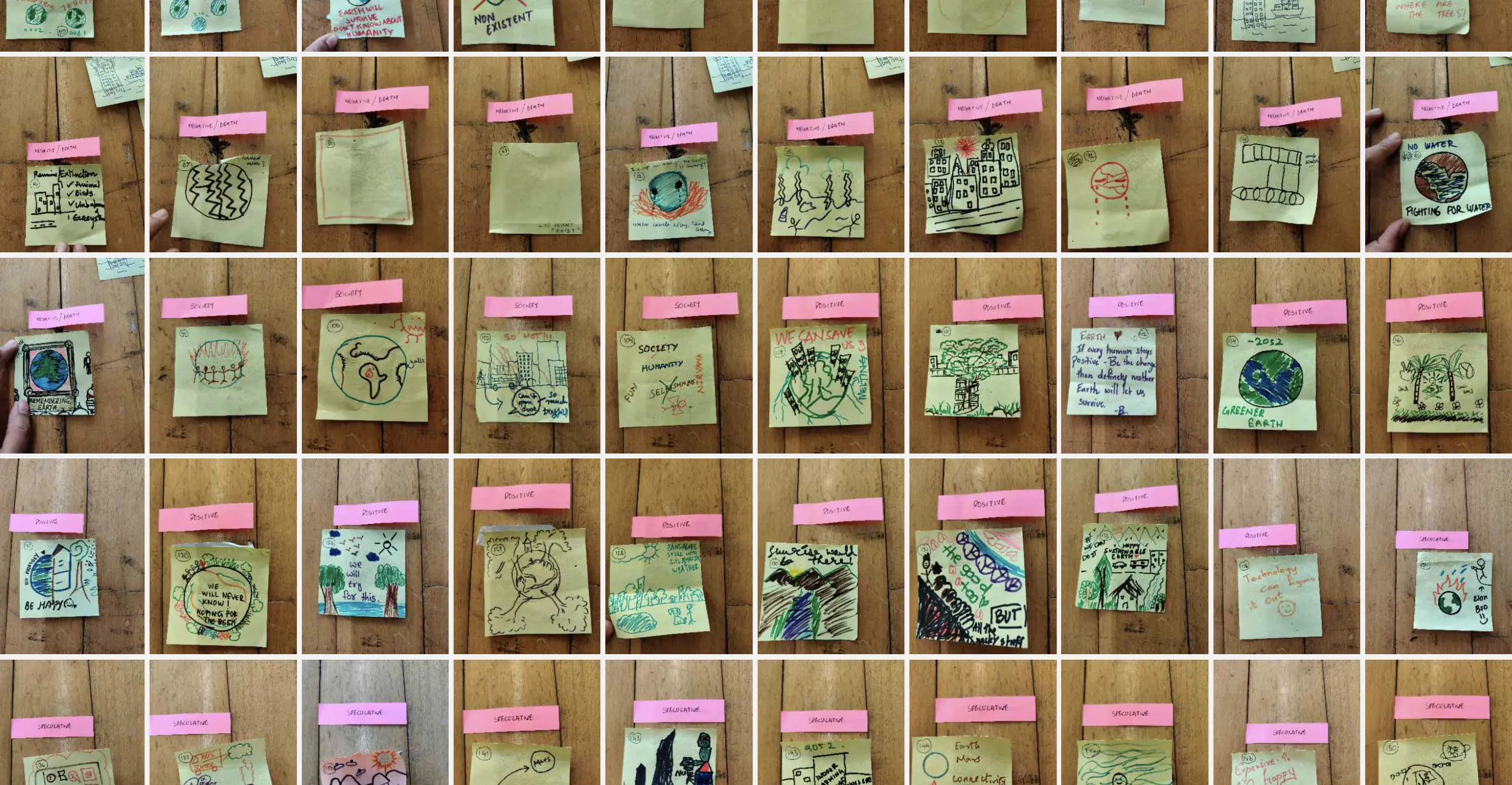
In 4 days, we collected 200+ speculative visual depictions of the Earth in 2052. Each passerby was prompted with a simple question, “what do you think the Earth would look like, 30 years from now, with regards to climate change?”. The collected responses were then analysed manually by using qualitative frameworks.
The responses were extremely varied. While some had little/no hope for the planet, others visualised how human beings might possibly be able to save the planet. Some depended on the technology moguls of the modern world to be climate saviours while others thought technology would enslave us all on a burning planet.
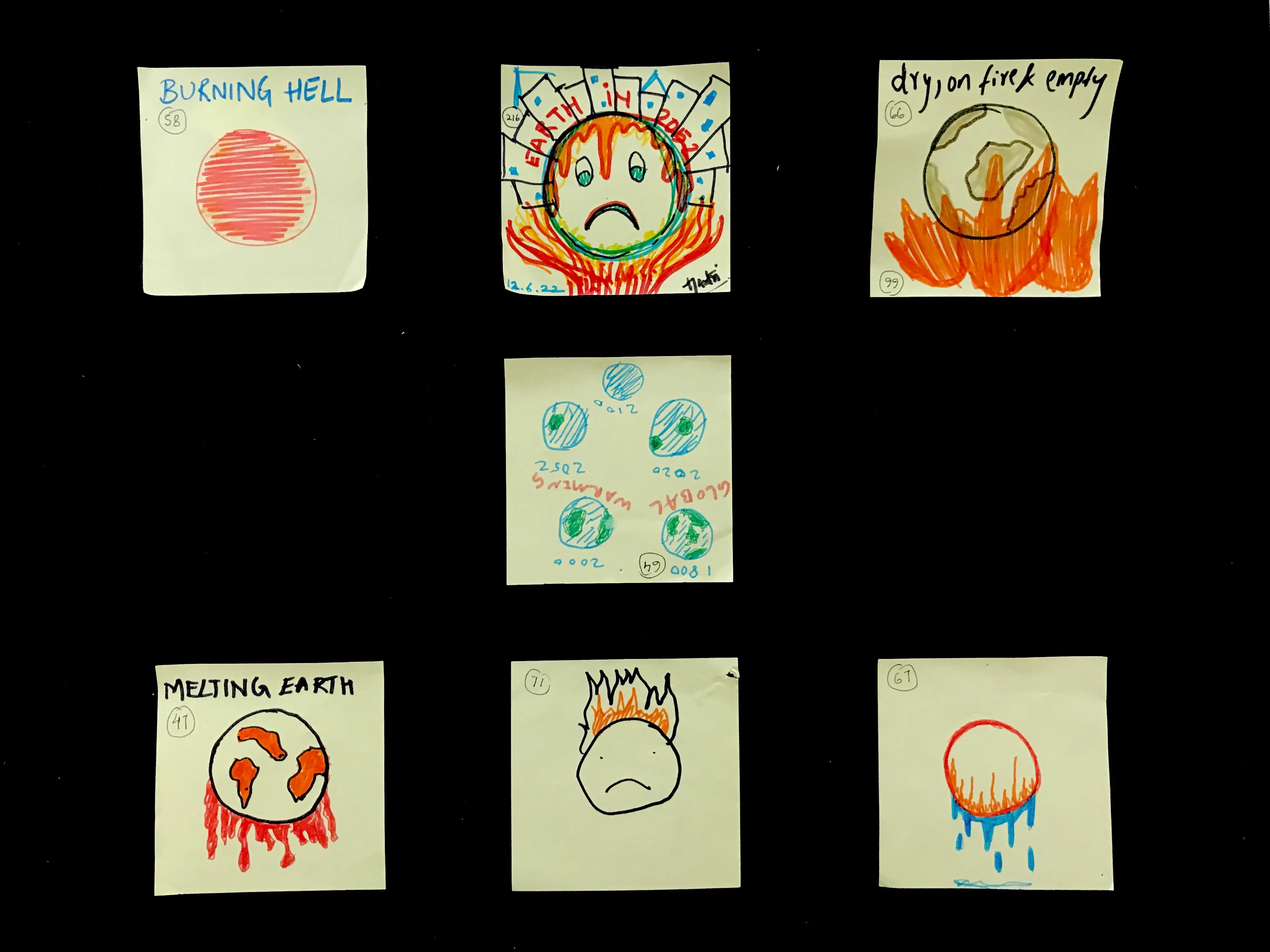
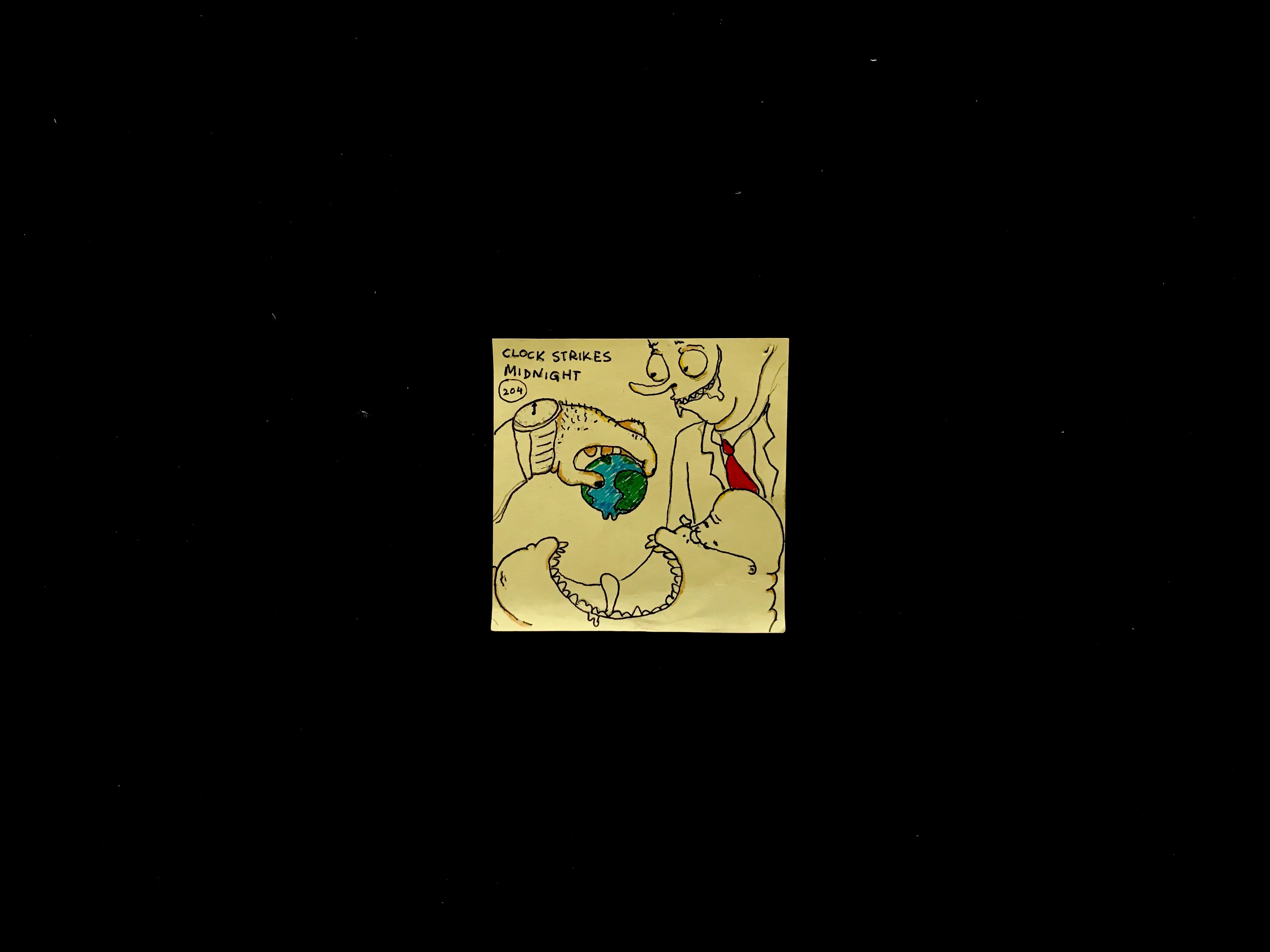
The Earth burning as depicted by 4 visualisations here.
One of my favourite visualisations out of the 200+, made by my dear friend Atreyo Roy.
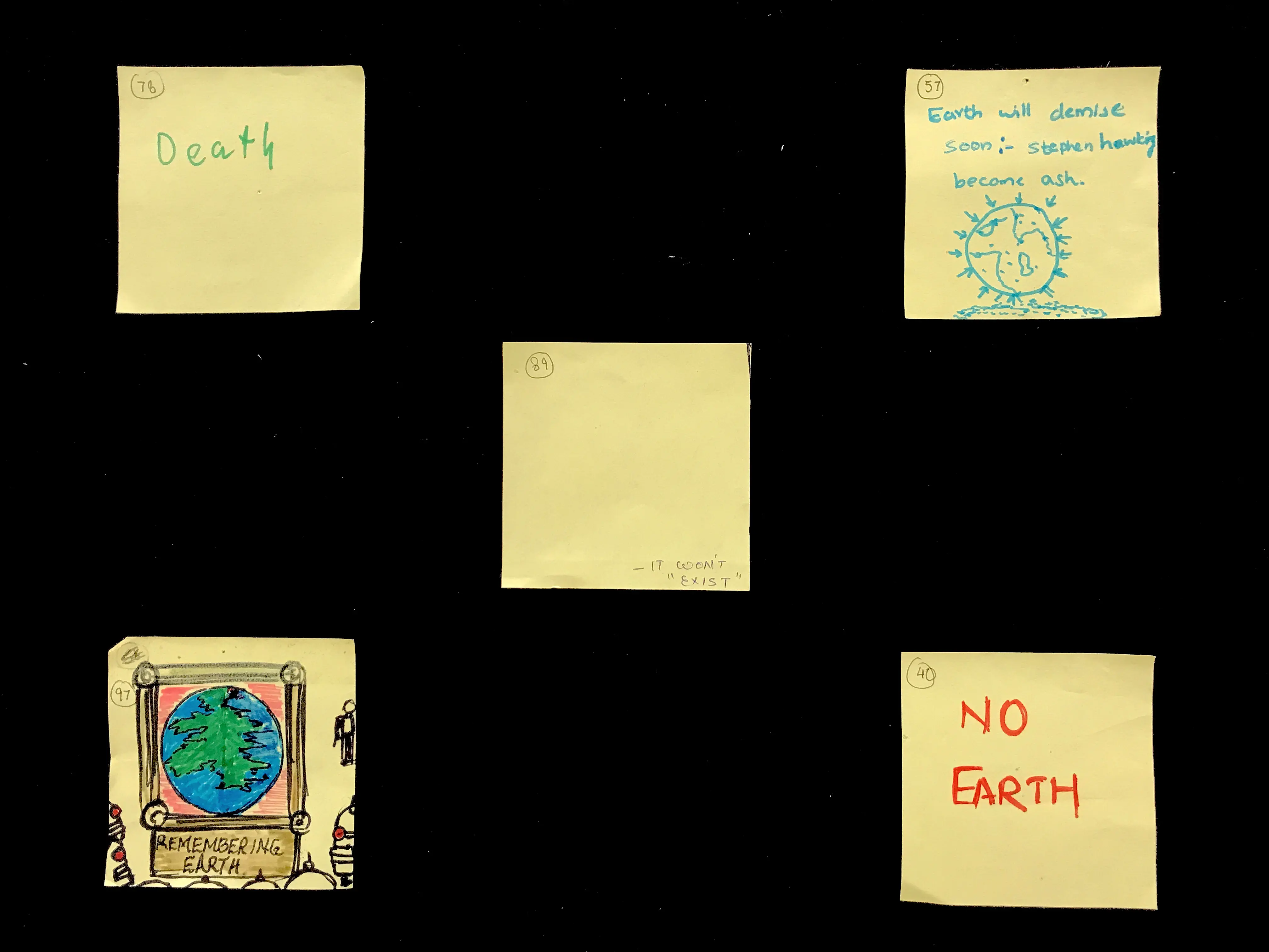
Some visualisations with little/no hope. Interestingly, the one on the top left was made by a 9 year old kid.
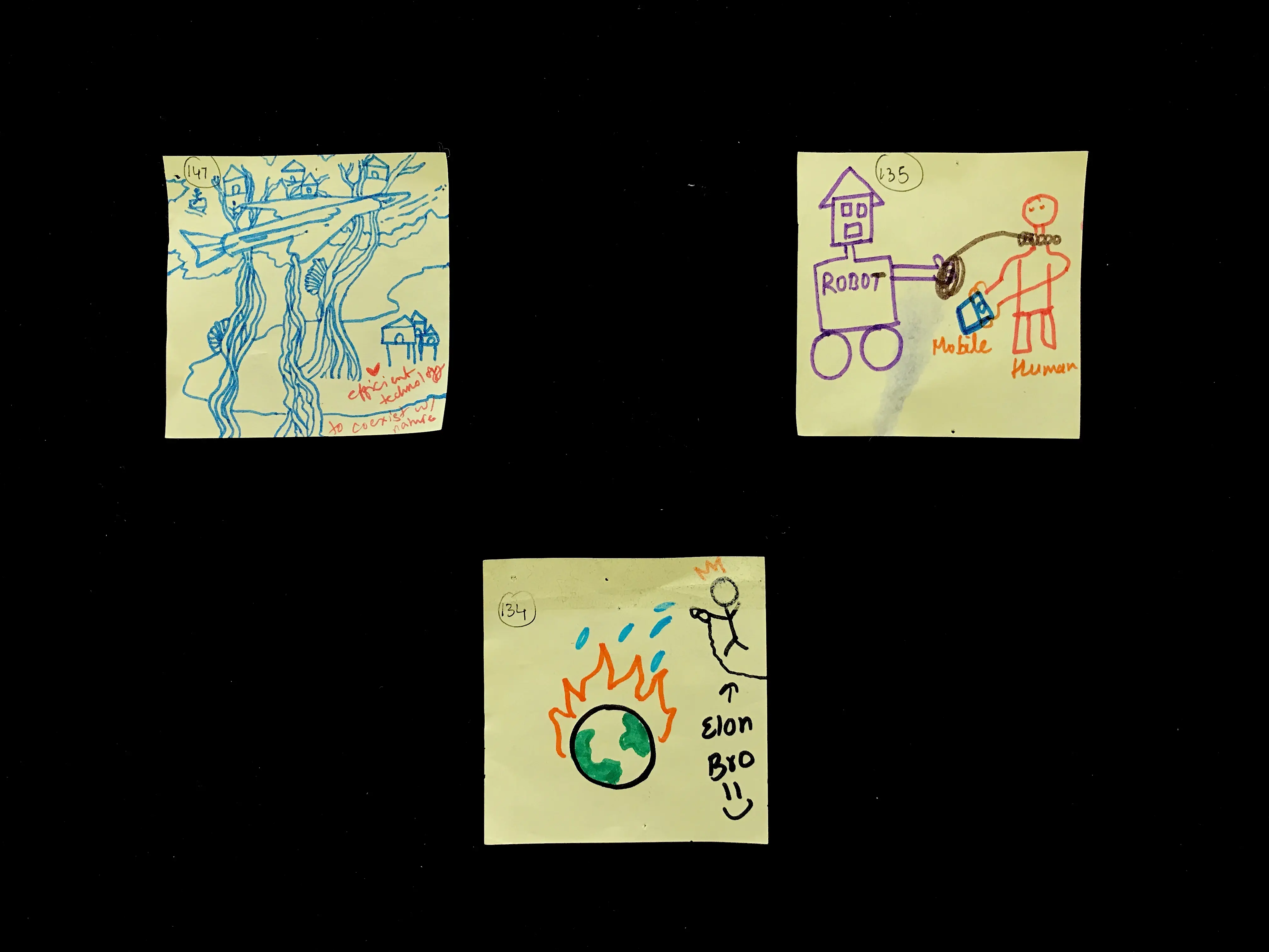
An interesting collection of visualisations that look at technology from different angles. While the top right visualisation hints towards a future where human beings are enslaved by robots, the one on the bottom highlights the belief that you adults have of technology moghuls saving the world.
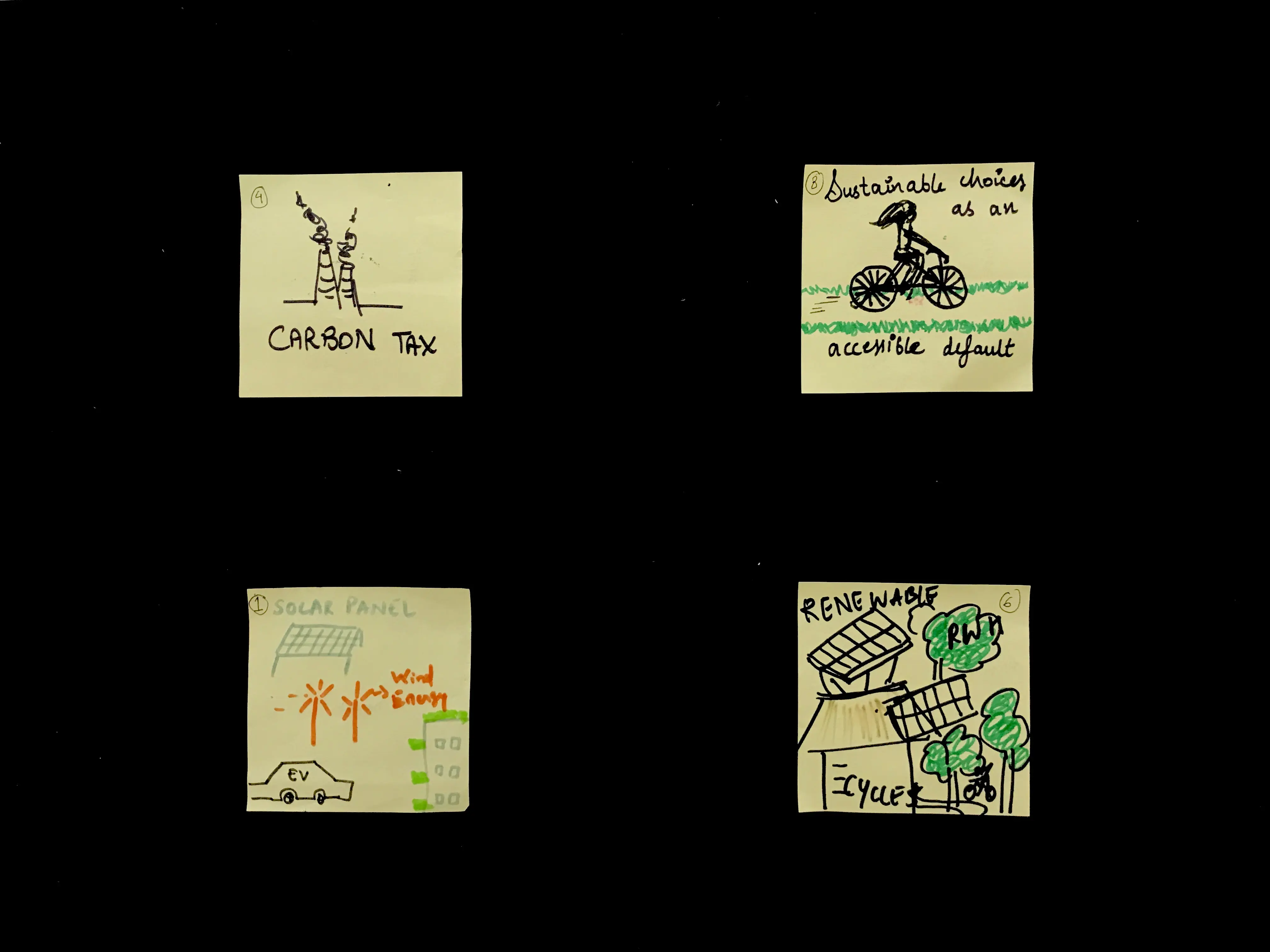
Not all of them were negative, however. Some of the visualisations communicated actionable steps that we can take towards ensuring a better climate future.
To derive an overall understanding of the nature of peoples’ responses, we decided to perform a sentiment analysis on the drawings. Each drawing was identified to be either a positive or negative drawing.
The three of us (Snehaja, Jyotsna & I), along with Vasudha, manually tagged each of the 200+ sticky notes as positive / negative / neutral.
I used the metaphor of a 'scale tilting in favour' of a particular sentiment to present the findings.
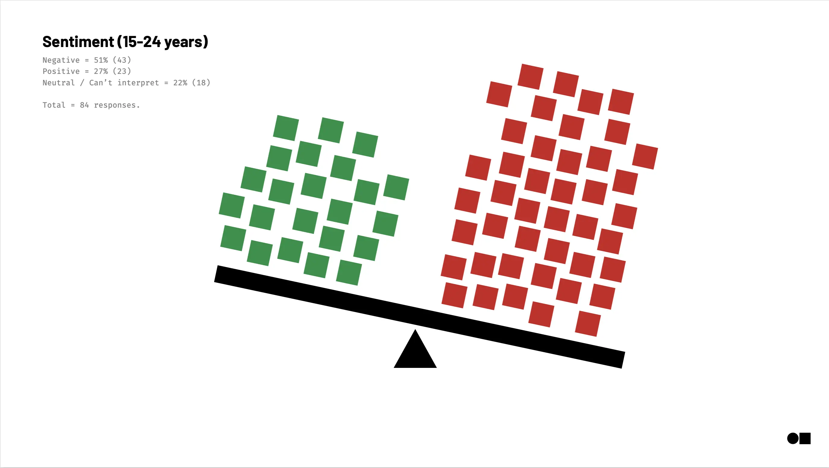
Sentiments of 15-24 year olds, as interpreted through the 84 visualisations.
As I engaged more with the data, I realised that each drawing could be summed up in a few keywords (based on what was depicted in the drawing). This could help communicate broader themes that were being communicated through the drawings. We derived keywords from each of the 200+ drawings and I generated a word-cloud online from the same.

A GIF of the word cloud.
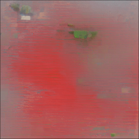
Personally, I became very interested in knowing what the computer would make of this data. If an image could be generated by using the top keywords derived from the youth’s perception of the Earth in 2052, it could be regarded as an accurate collective visual (with the subjectivity of the computer, of course). I used three AI methods (the Altair method & Orion method on StarryAI) as well as the popular OpenAI tool, DALL-E, to generate the visuals below.
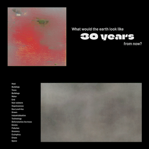
Both of my outputs, including the keywords that I used.
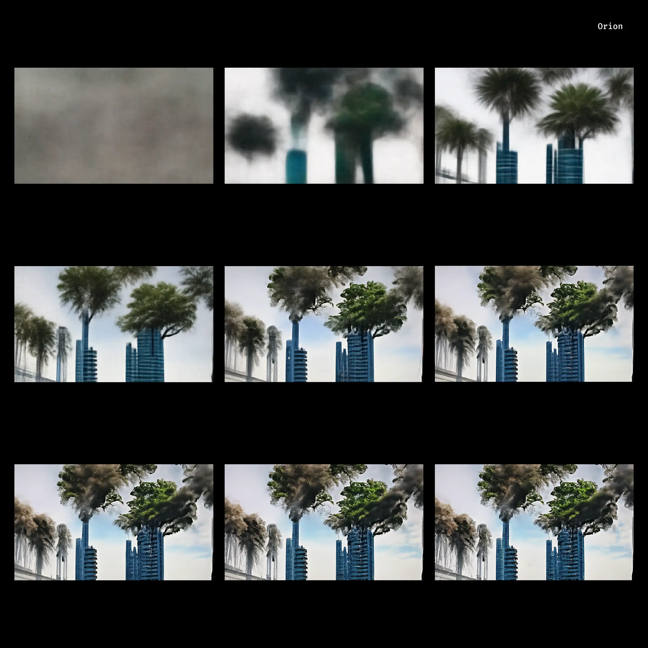
The development of an image using the Orion method.
These findings were presented virtually at the Hot & Bothered Youth Symposium 2022 and saw over 70+ participants.
A small teaser that I made for the final presentation that played as people joined the virtual call. Unmute for some nice beats :)
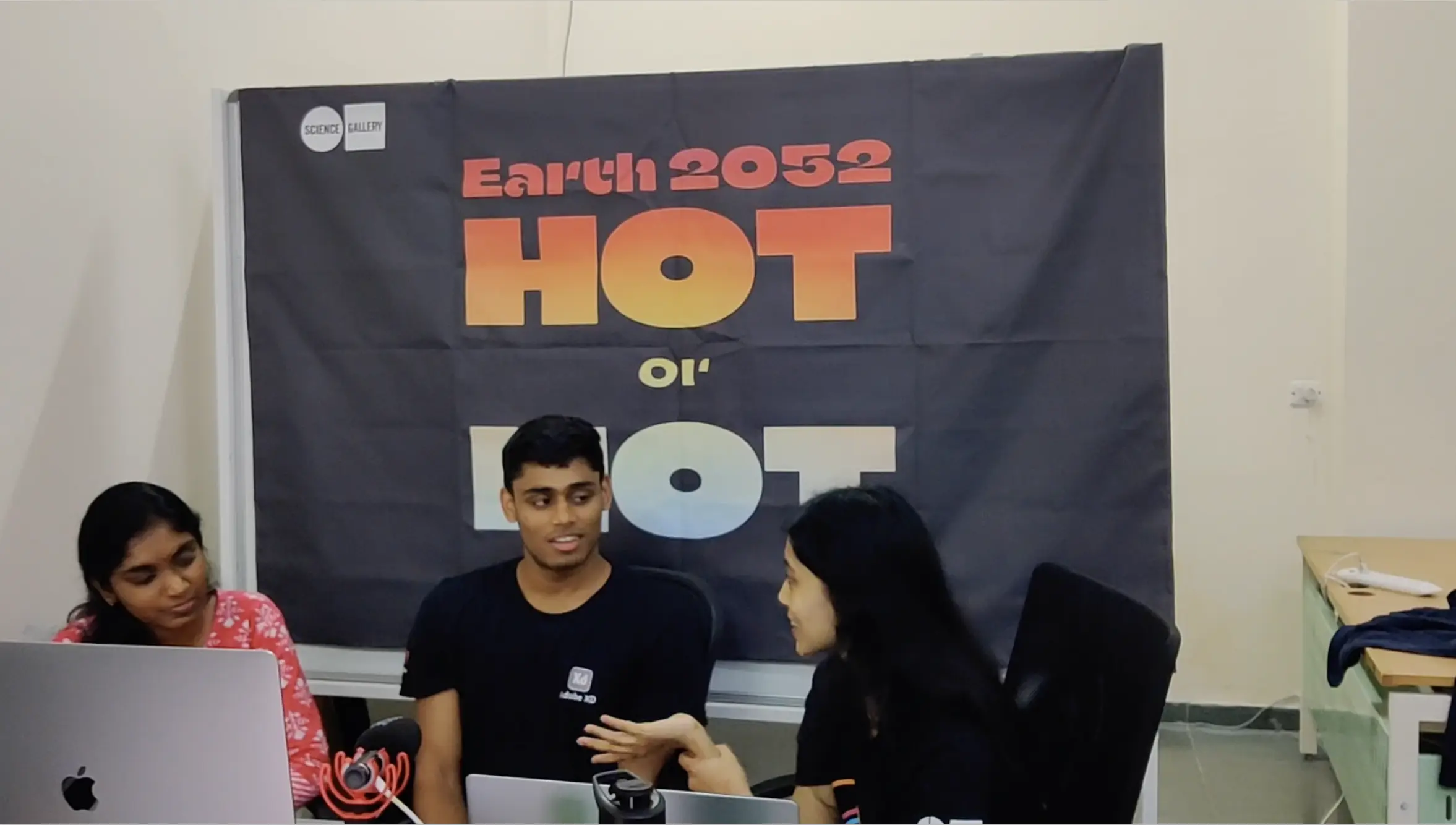
Us presenting at the conference from the Science Gallery Bengaluru office. Photograph by Vasudha Malani.
A snippet from the 2022 Youth Symposium Report, published by the Science Gallery Network.