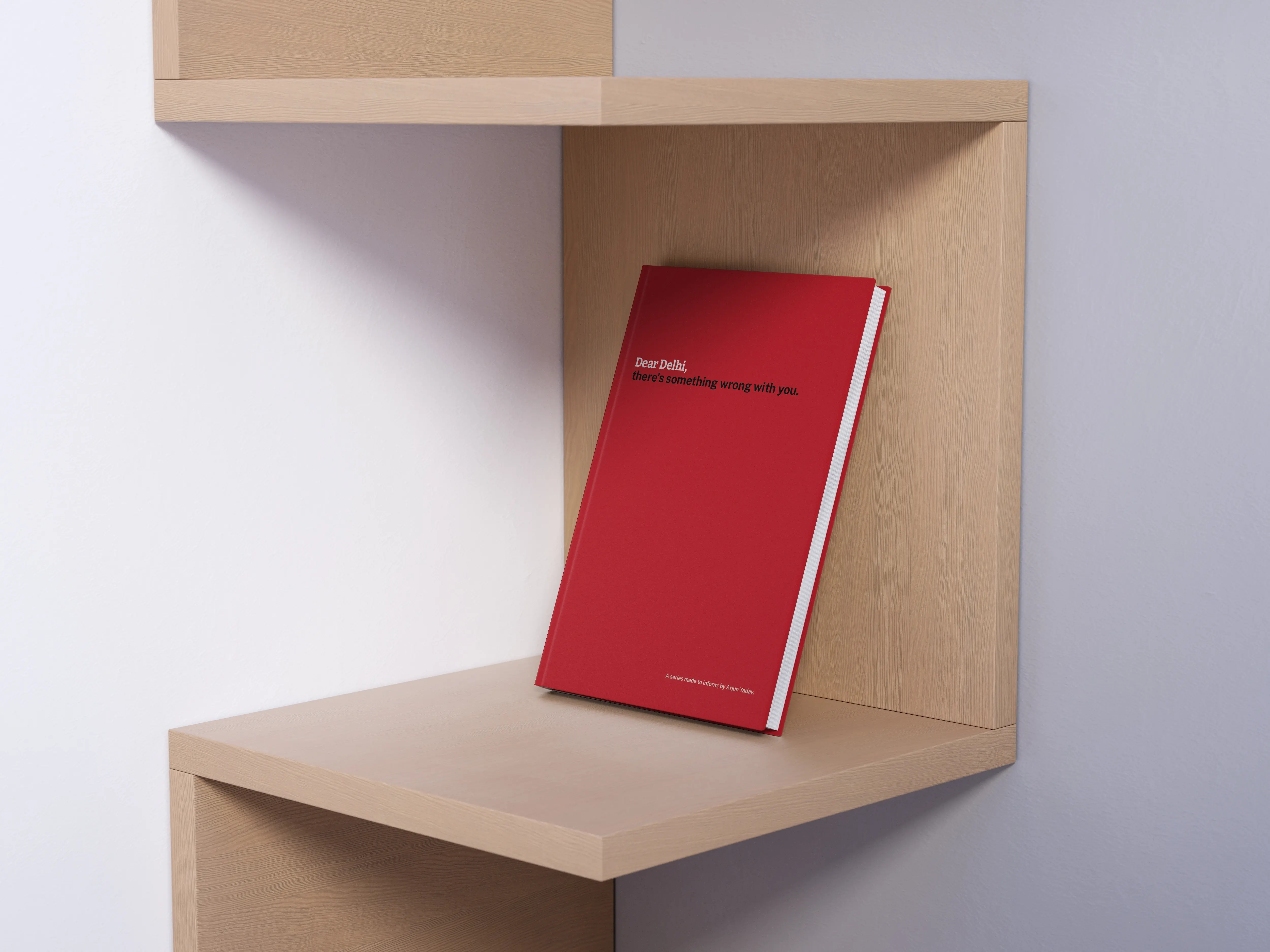

In my 3rd year at IIAD, each student was asked to choose a “path” – an area of communication design that we would like to explore in depth. That particular year, I had fallen in love with typography and chose to tackle the ISTD 2021 Student Brief. The brief very clearly read:
What can a typographer do to address the imbalance, to harness, shape and organise words in service of breaking barriers? To encourage reflection, respect, and self-awareness between communities?
As a starting point, the brief put forward the activist poems of Gil Scott-Heron and the media theories of Marshall McLuhan. Over the course of two weeks, I explored racial, sexist, political and religious imbalances on a global, national & local scale.
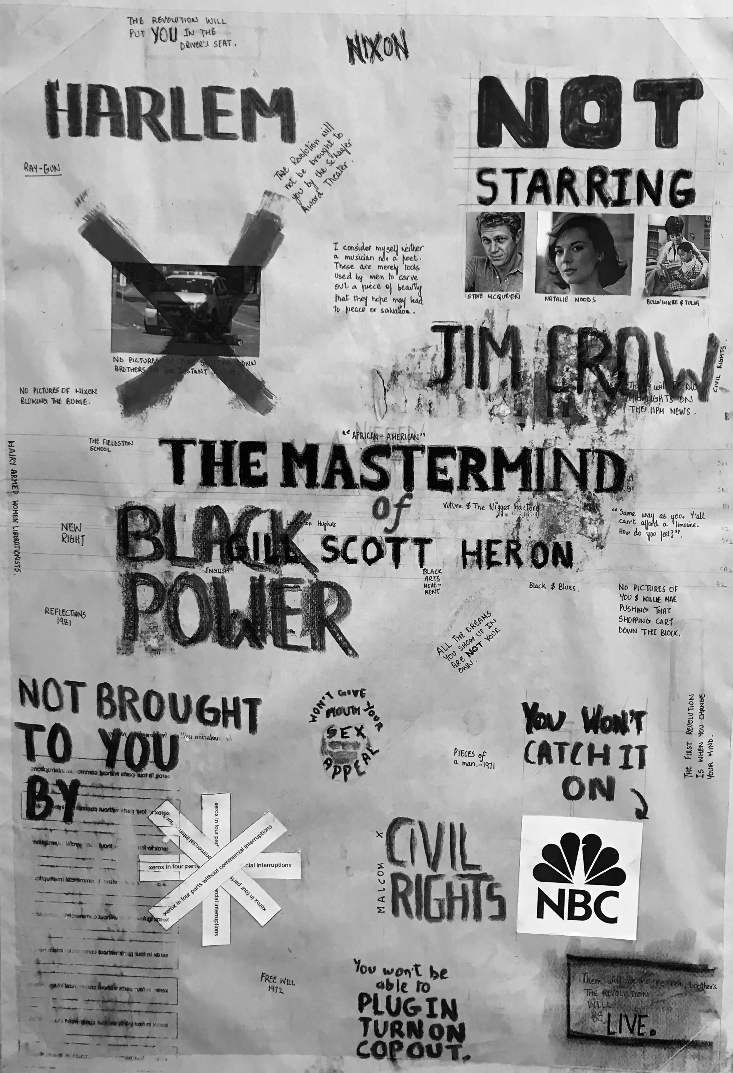
Exploring Gil Scott-Heron's poems in the 1970s.
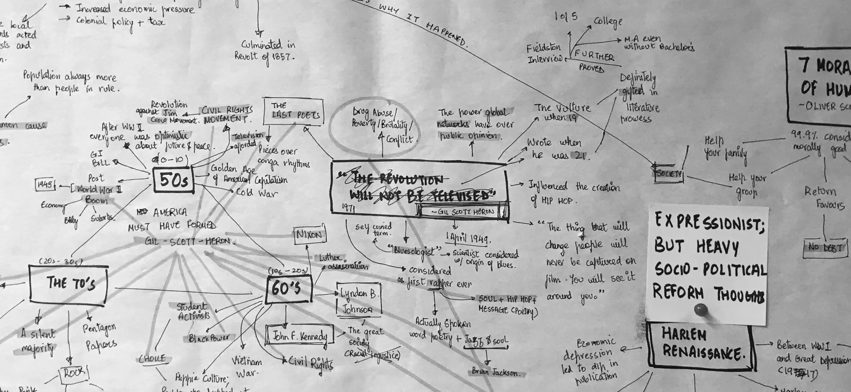
Studying racial, sexist, political and religious imbalances in America.
After two weeks, my mentor prompted me to explore locally rooted issues that continued to exist around us
without being explicitly discussed. The power of typography could truly be harnessed then. I agreed.
I began exploring the roots of “casual racism” in the city and a huge chunk of it was directed towards
Northeastern migrants. An ethnographic study done by Duncan McDuie-Ra, titled Northeast Migrants in Delhi: Race, Refuge and Retail
became a pivotal resource in my study. It was shocking to see that Duncan’s findings, first published in
2012, held true even in 2021. Not a lot had changed for almost 10 years and that became a pressing issue. I
further explored this context through informal interviews with acquaintances in Munirka & North Campus,
areas in Delhi infamously known for a high density of Northeastern migrants.
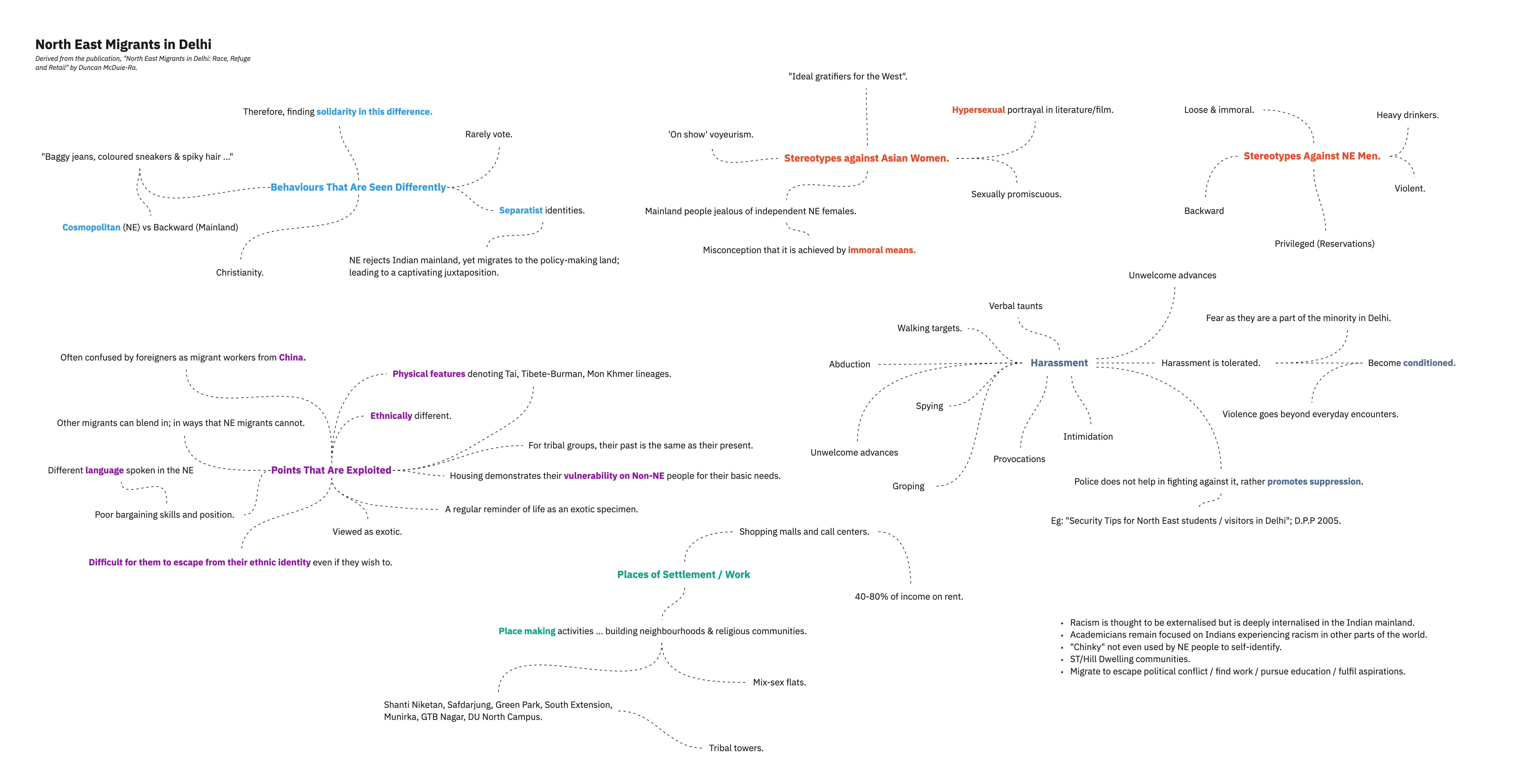
Findings from Duncan's study, further substantiated by my own enquiry.
At the same time, I was also exploring typographic forms to get familiar with the medium. I started to draw out parallels between the Latin alphabet and the feelings of Northeastern migrants in New Delhi. The idea then became about communicating facts through typography and indirectly converting the disturbing truths that I had uncovered in my research.
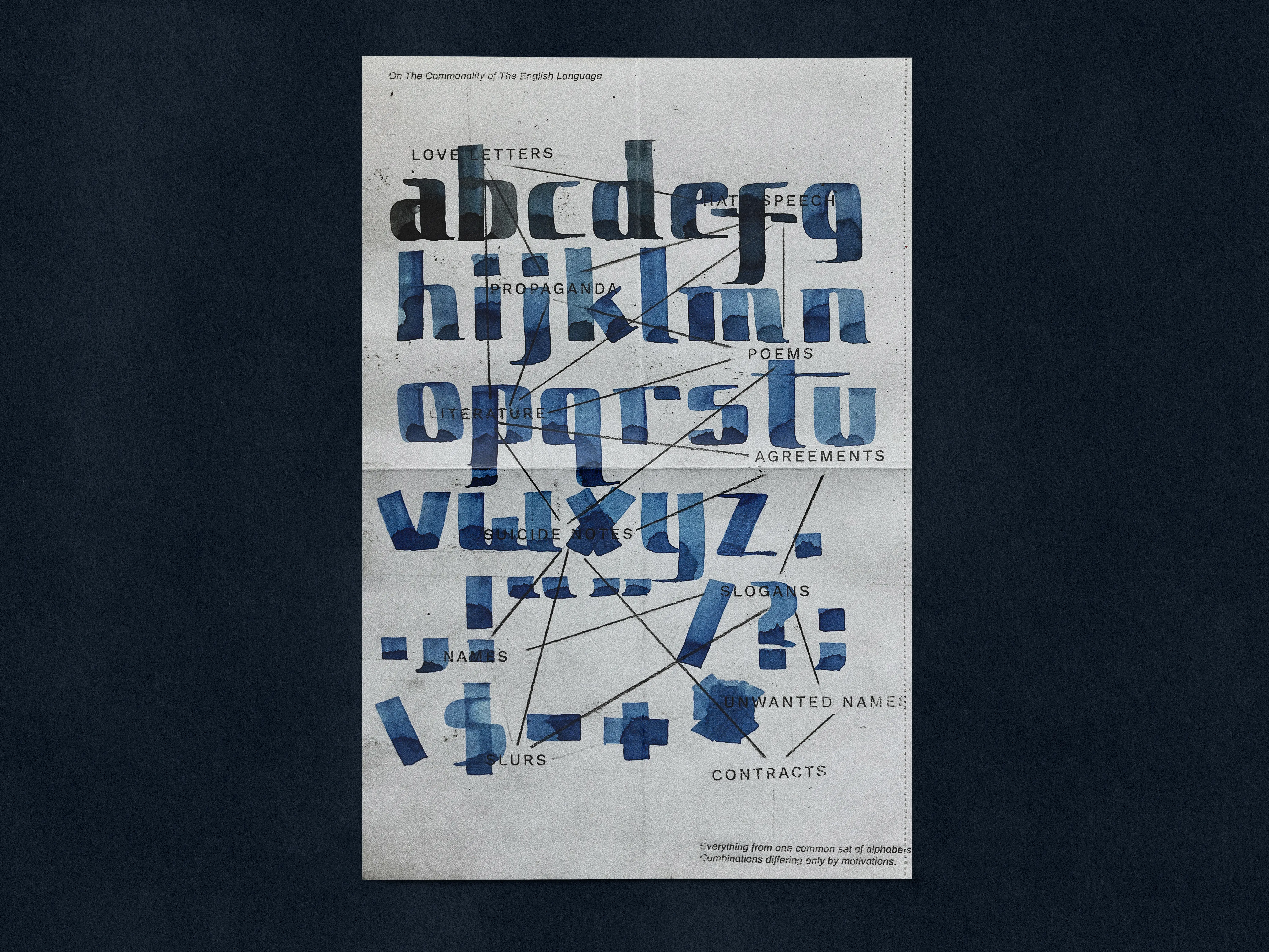
A typographic thought of love & violence emerging from the same set of alphabets.
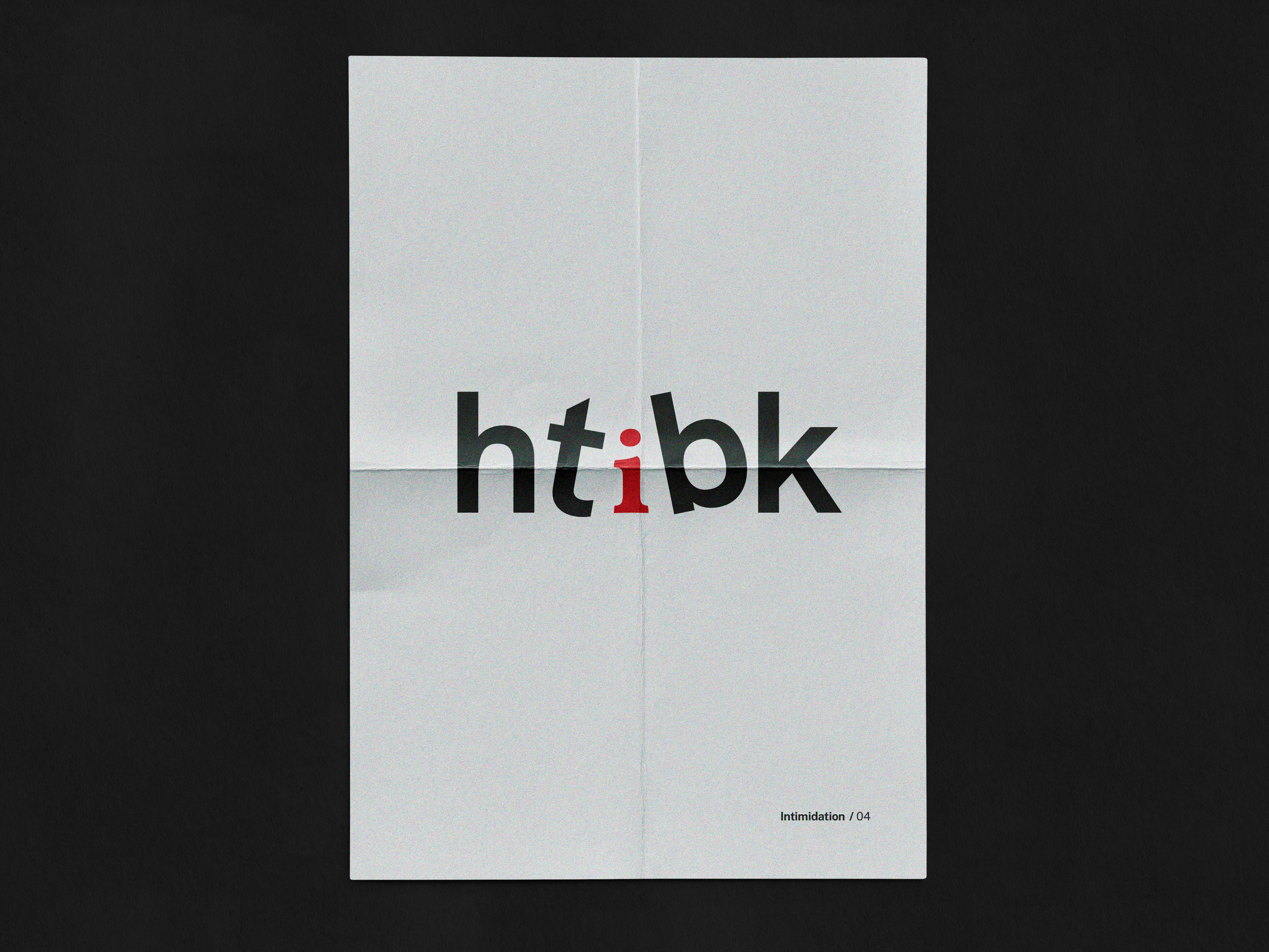
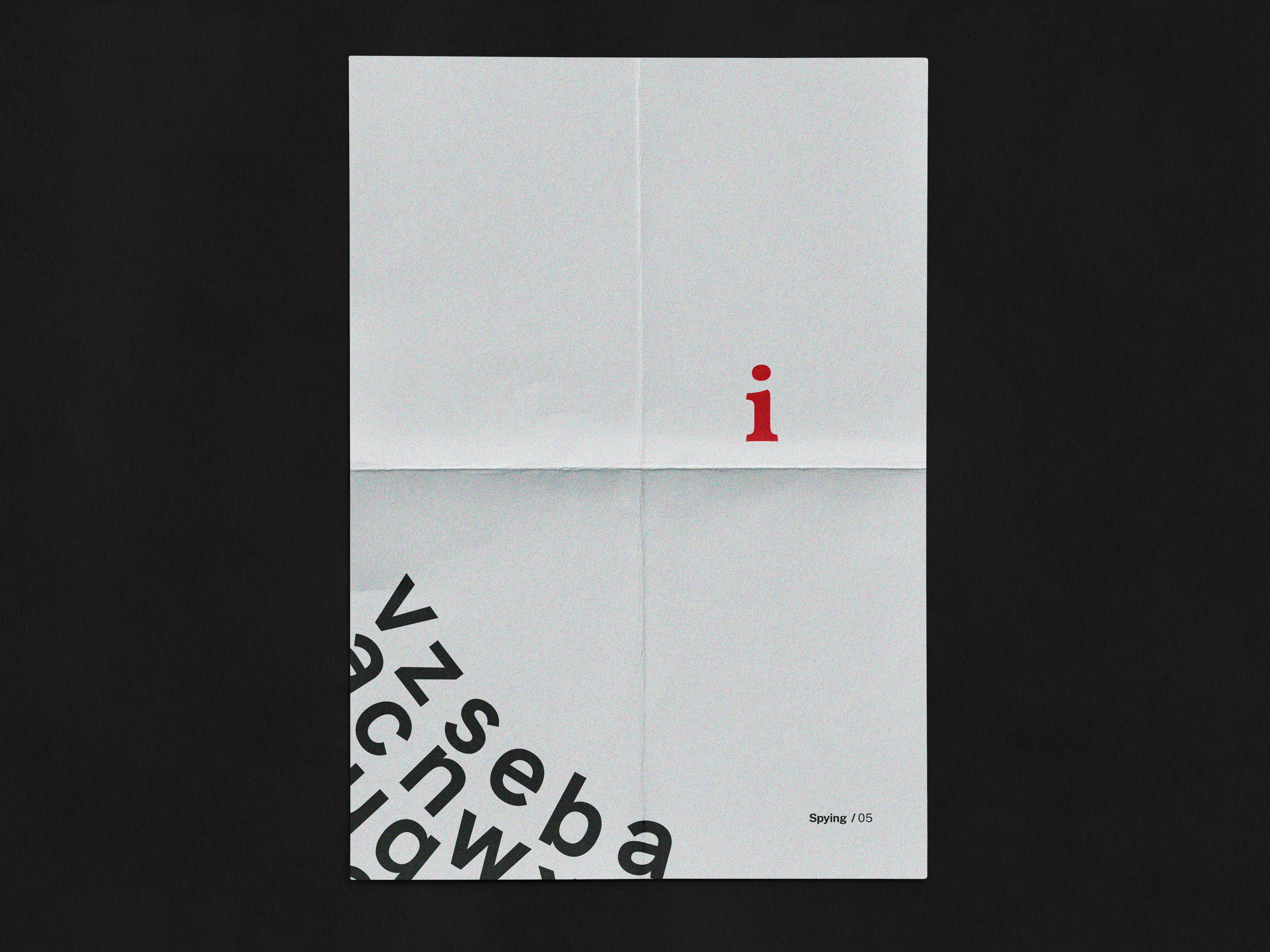
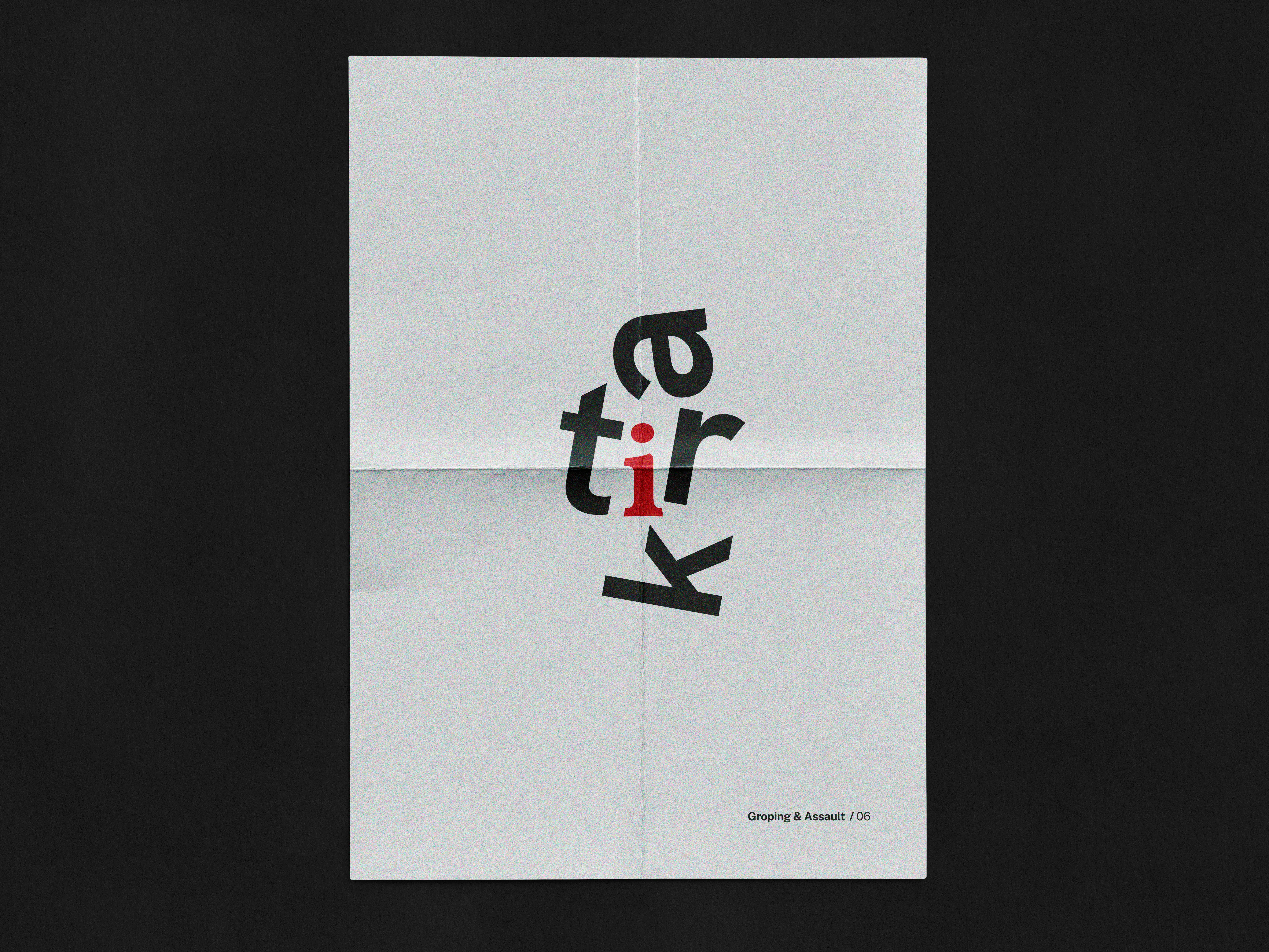
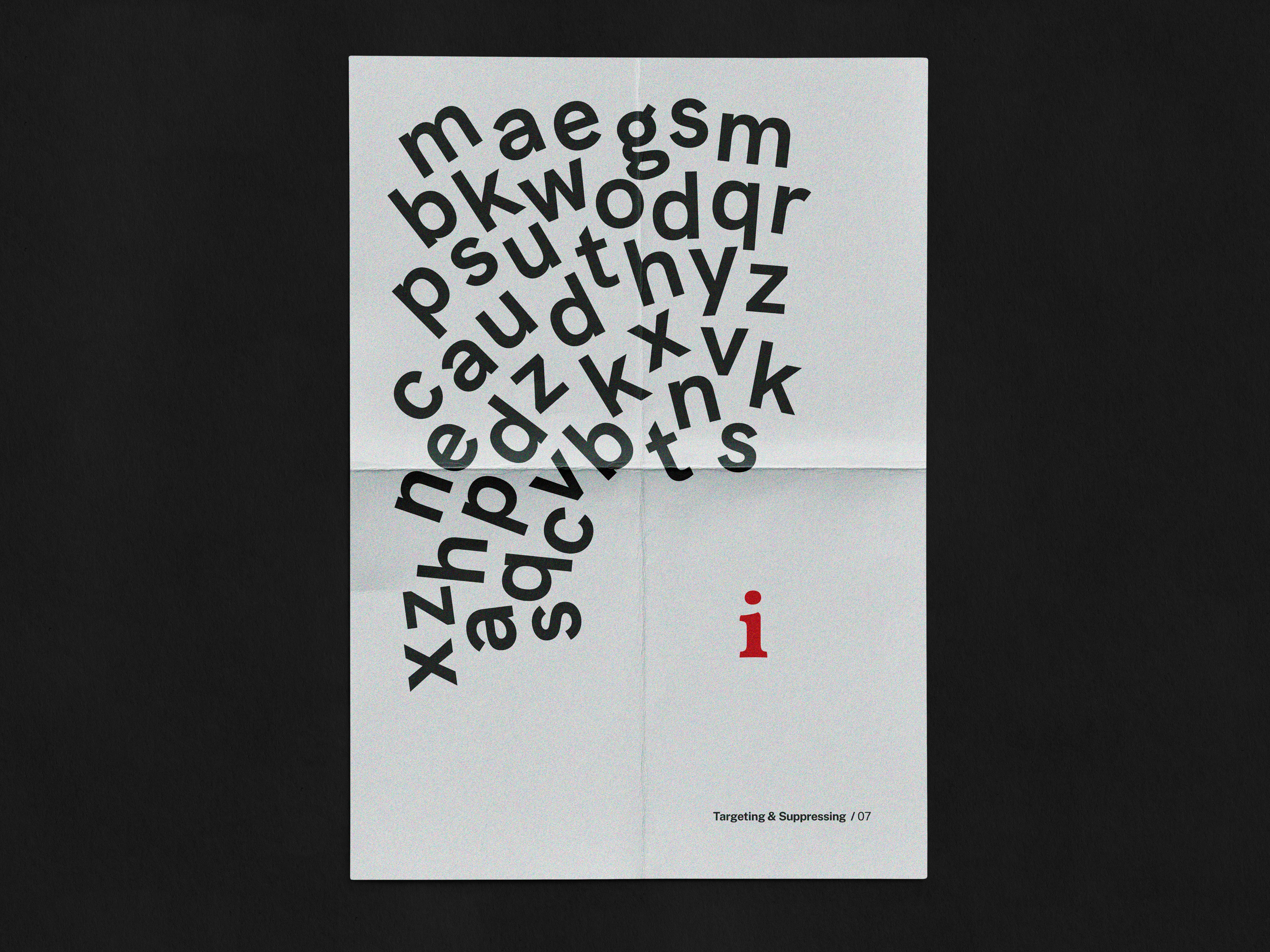
The final outcomes were a set of 6 typographic posters, an A5 sized book and a 1700-word case study.
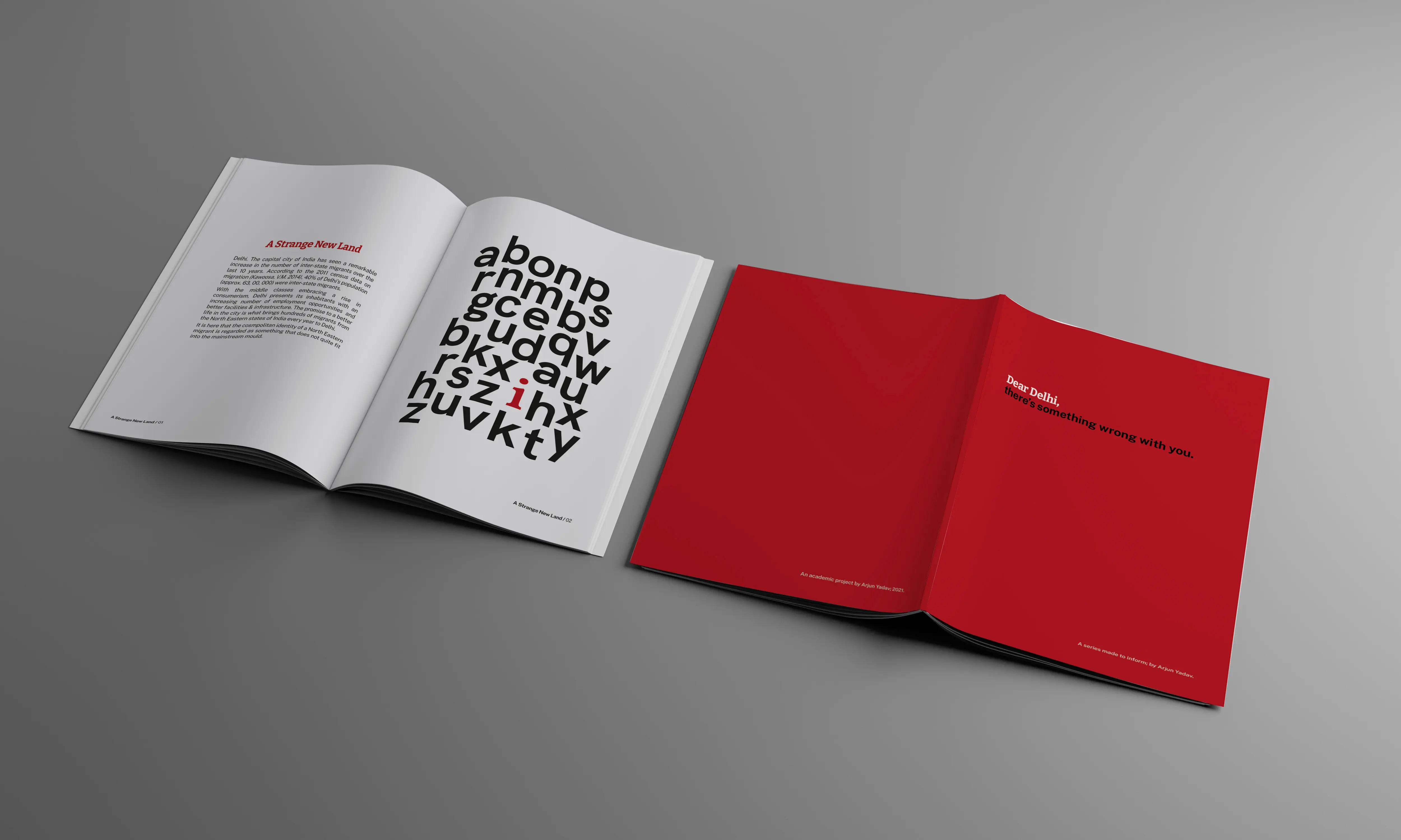
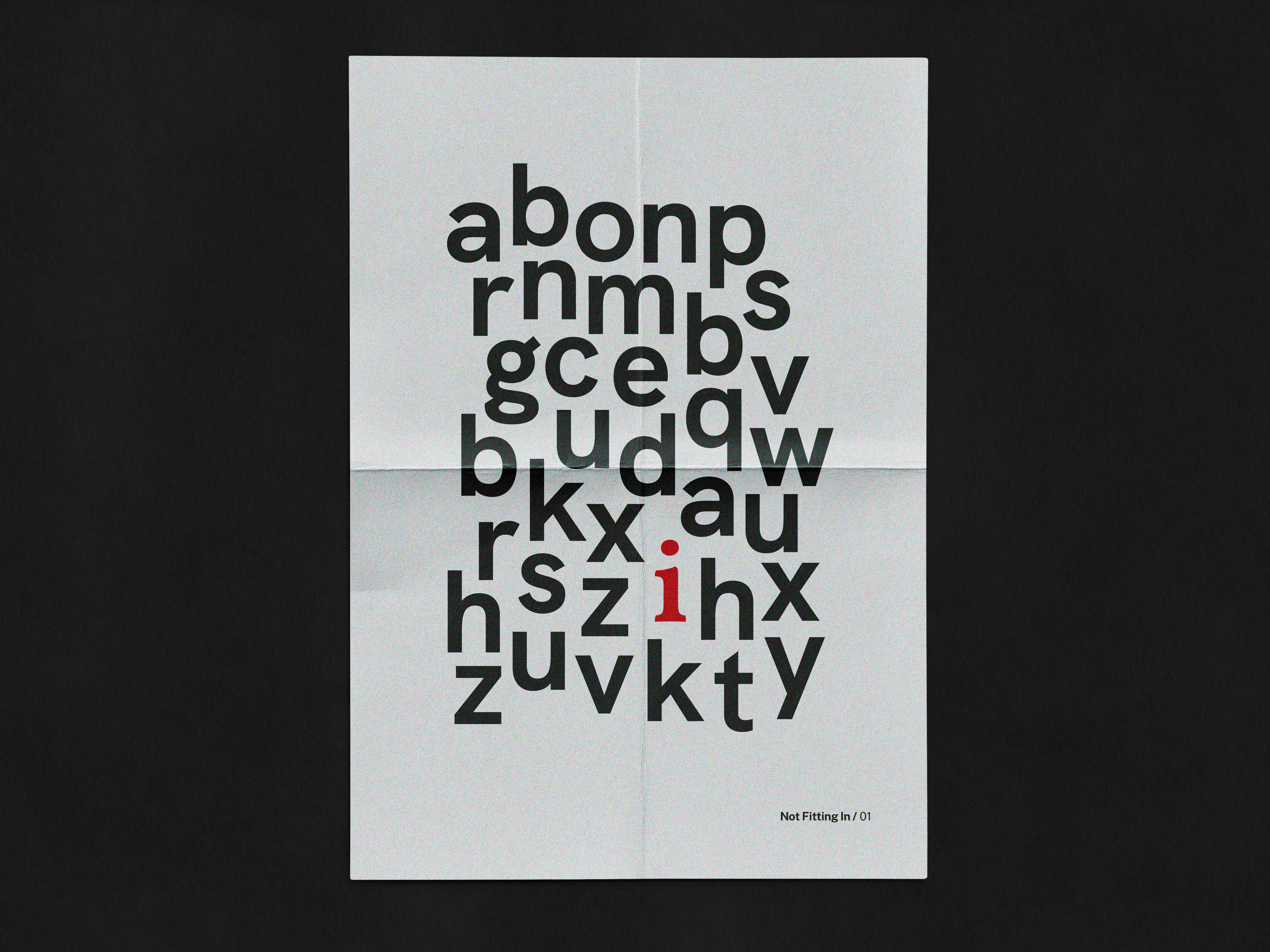
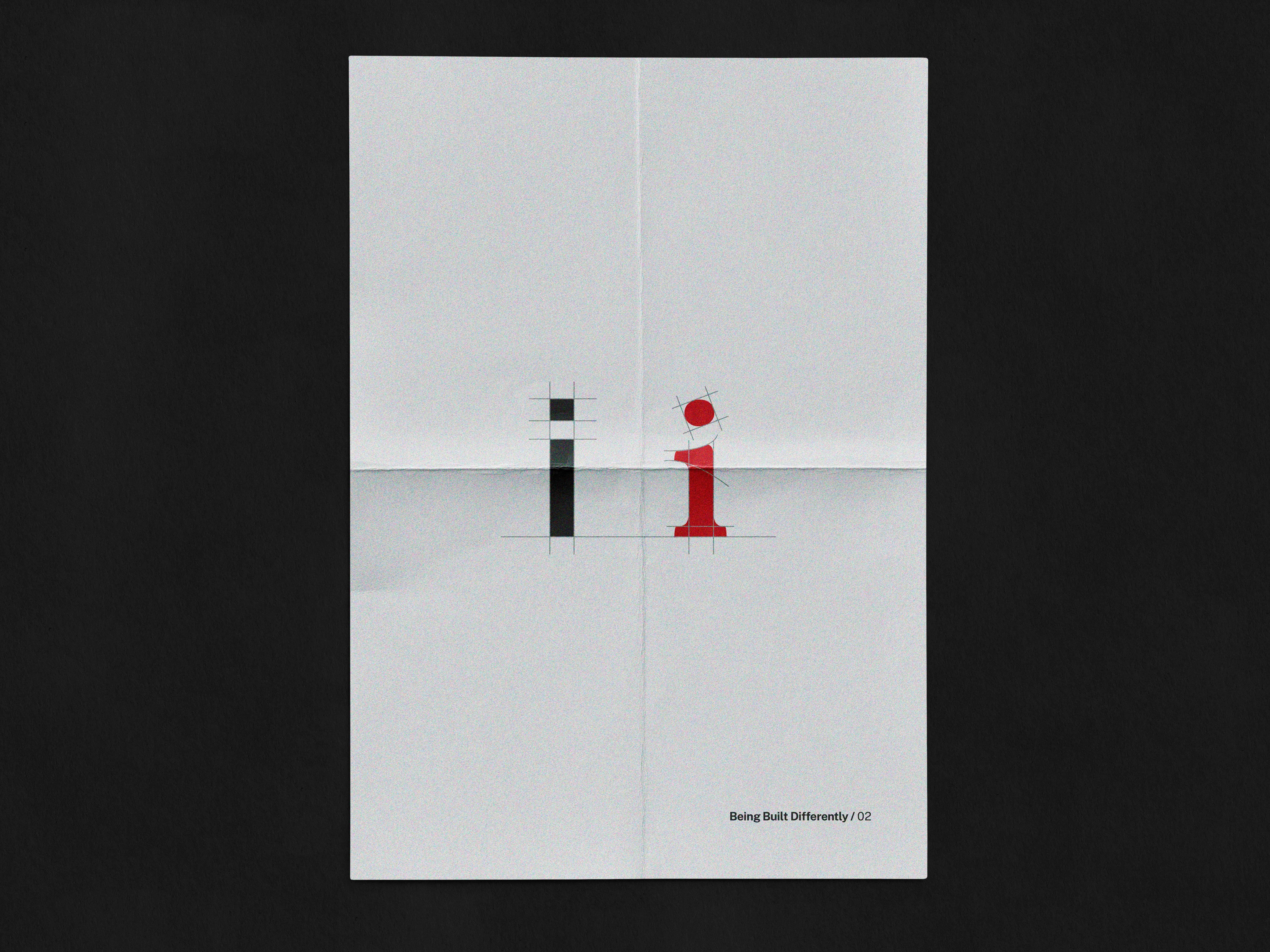
The full A5 publication can be viewed here. Individual posters are below:
The full case study can be found here.