End-to-end redesign of the onboarding experience for Canonic
Sole-designer
Mentors: Aditi Jain & Simranjot Singh
Developer: Pratham Agrawal
Over the summer of 2021, I worked as a product design intern at Canonic, a low code backend development platform. The digital product (at the time, a web application) allowed people to create entire backend systems from scratch by using a graphical interface. The platform could create databases, allow for the management of a CMS and use APIs to deliver data on the frontend.
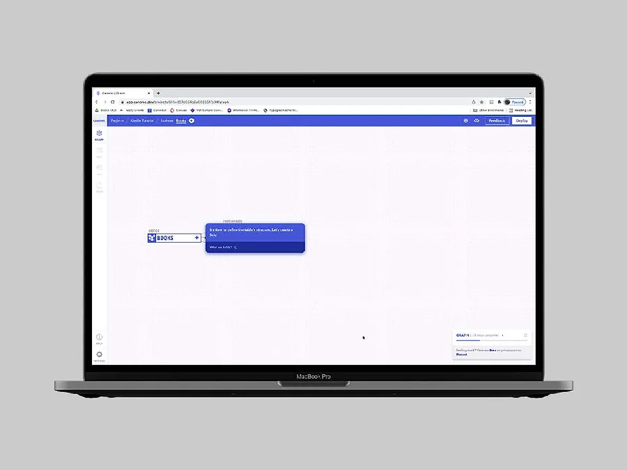
A screenshot of the platform in action while creating a database of books, similar to that of Goodreads.
While I worked on other smaller design projects over the course of my 2-month long internship, redesigning the poorly performing onboarding experience was my primary task. The retention rates after onboarding rose from 17% to 39% after the redesign.
I used a combination of quantitative data from the platform, along with moderated user interviews (primarily with new users) to understand the problems at play. Important ones are listed below:
Poor User Retention After First Interaction
There was a mere 25% retention rate after the completion of the first out of three stages in the onboarding process.
High Cognitive Load
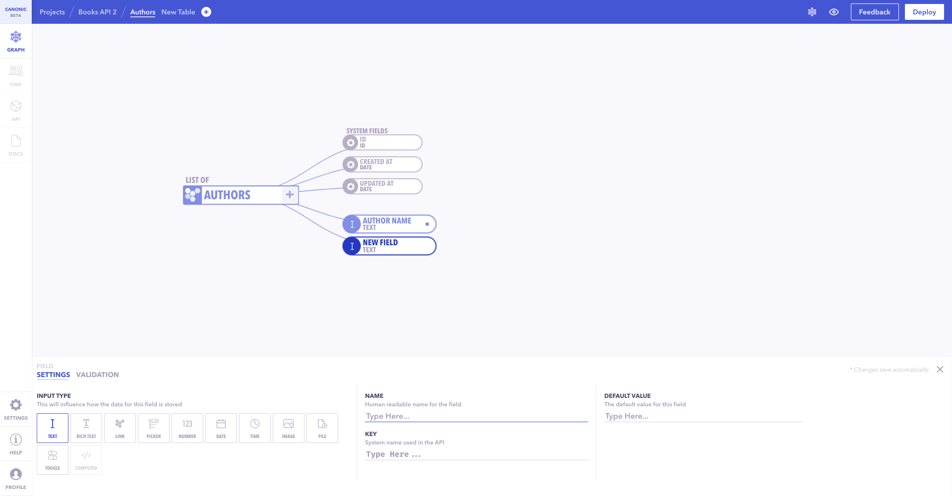
The onboarding prompts had often irrelevant lengthy explanations and took more time than intended to comprehend (as shown below).
Low Number of Onboarding Projects
The total number of projects available to the users were few, meaning that people skipped onboarding altogether if they couldn't find a relevant project that was in line with what they wanted to build later.
Generic Projects
There were no specific onboarding projects from start to end, but rather the same project given to everyone irrespective of the development experience that they had.
No Intimation About Errors
People who tried onboarding for the first time often felt stuck at certain parts of the journey, as they may have performed a wrong action very early on in the process, that they were never notified of. This led to them not being able to progress to the next step as their input was not what the onboarding algorithm expected (as shown below).
Apart from the ones listed above, other problems such as the onboarding not feeling developer-friendly, the large amount of copy to be read overall and the absence of a reusable component system were also taken into consideration while designing the new onboarding experience.
The first outcome was to redesign the architecture of the entire onboarding experience. By analysing the earlier used architecture, I understood that there were many dead-ends and irreversible steps in it.
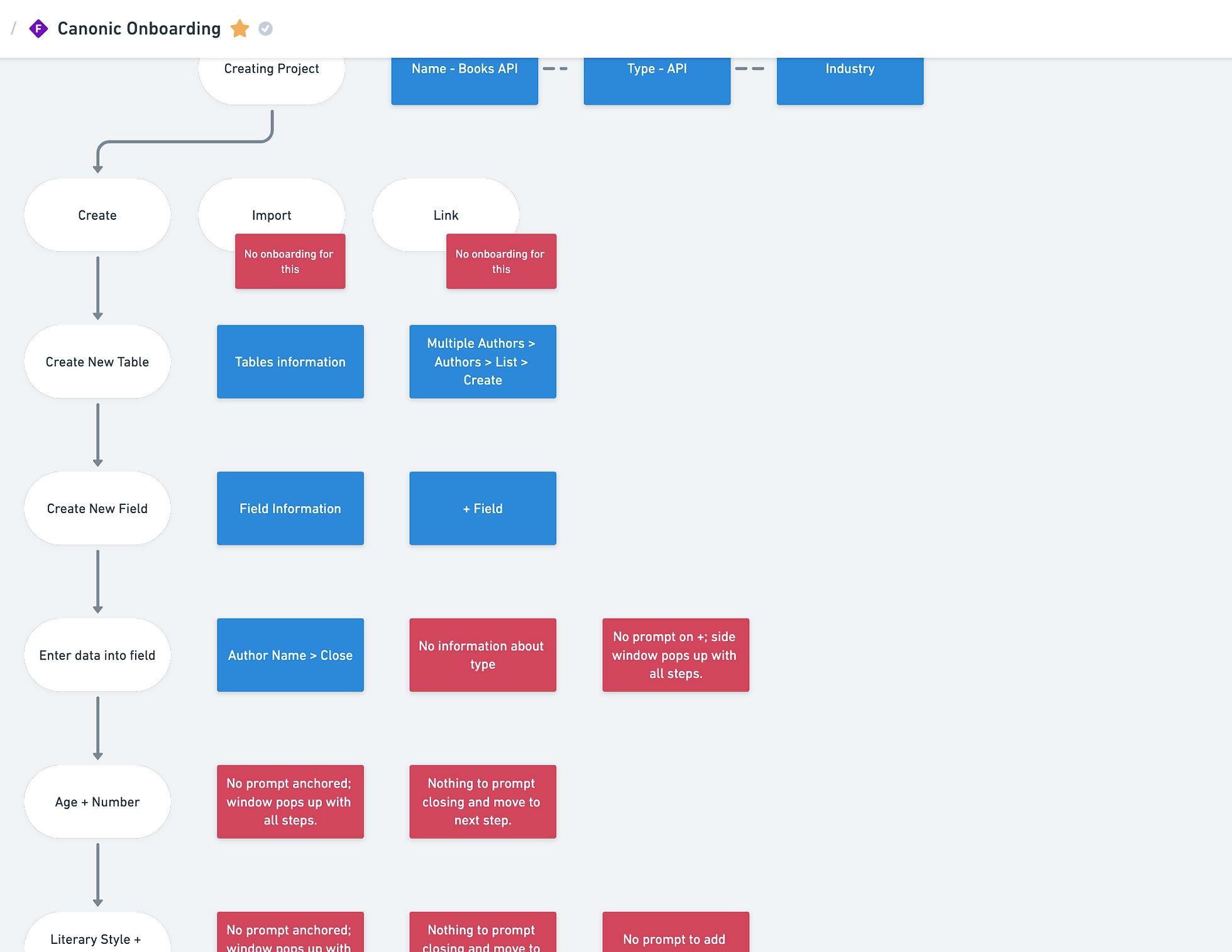
A zoomed-in screenshot of a map that I made, highlighting each dead-end and problem in red with the existing architecture.
When I viewed the architecture at large, it was hard to miss the fact that most projects on the platform followed the same general structure. You would start by defining the database schema, in Canonic's case, the 'graph view'. Then, you would add entries into the CMS and proceed with creating APIs to fetch data for your frontend to display.
In order to achieve the goal of creating a flexible system that adapts to any kind of project that the user wants to select for their onboarding, I worked with the team to create an adaptable information architecture.
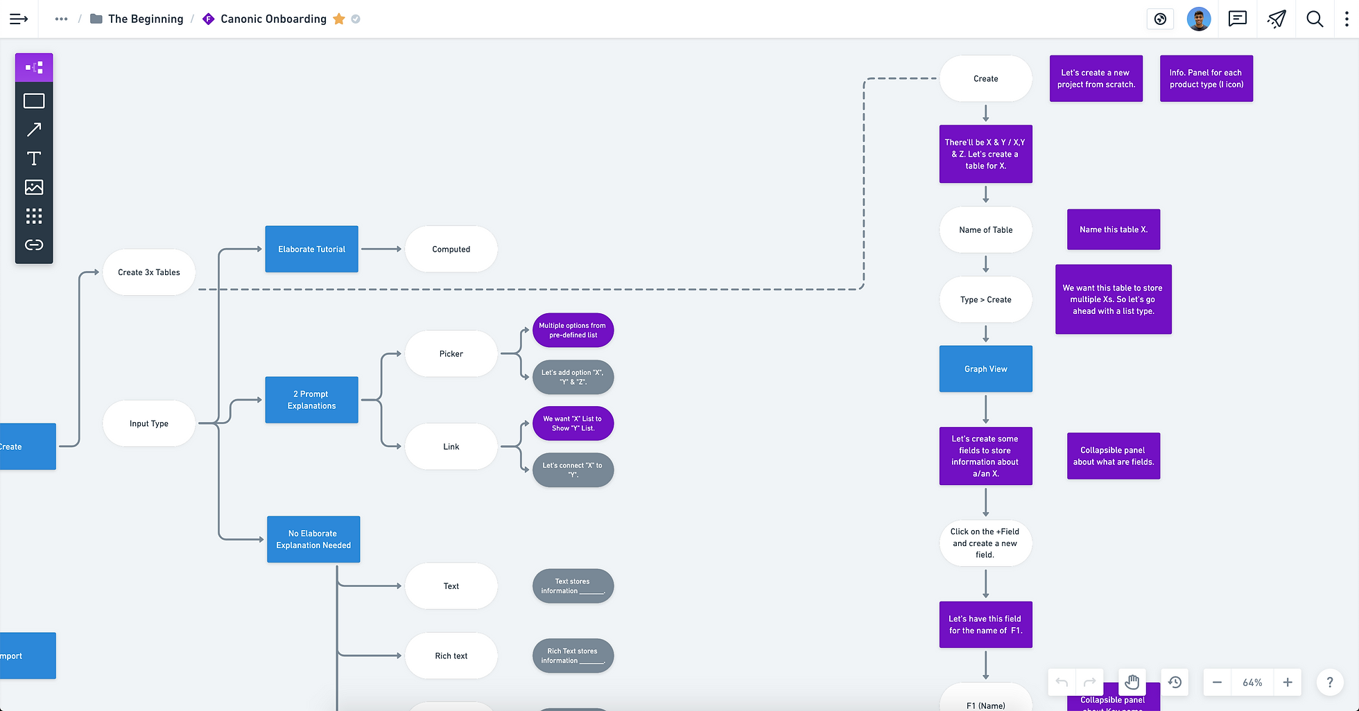
A zoomed in screenshot of the final information architecture, made on Whimsical, that highlights the usage of variables & constants for the architecture to adapt to any Canonic project and turn it into an onboarding project.
Each project then became a guided onboarding experience with different prompts that guided users. The prompts were made as part of a design system, that highlighted the usage scope of each type of prompt.
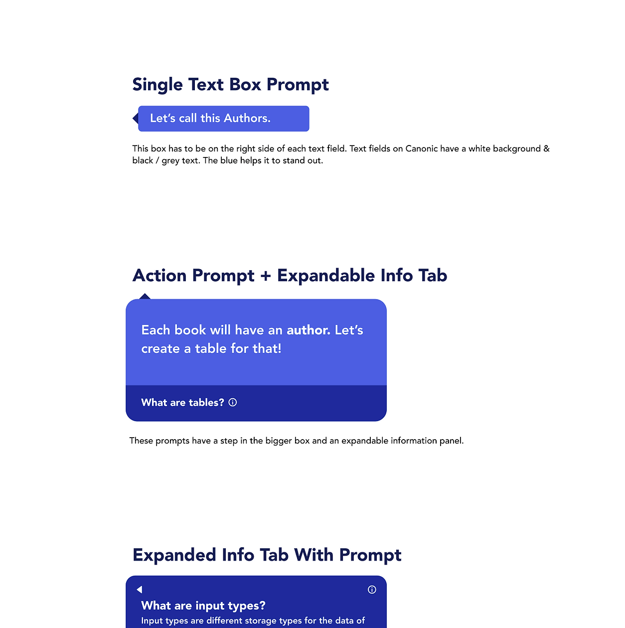
A small snippet from the larger design system; this section being for 'text prompts'.
The proposed redesign was then handed off to Pratham who worked his developer magic to get the redesign working before Canonic publicly went out of beta on ProductHunt.
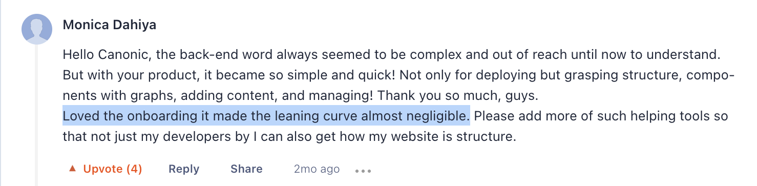
A comment by someone on ProductHunt that specifically talked about the onboarding.
I then led the user-testing for the new onboarding, after the ProductHunt launch. We tested with around 15 people, who had varying levels of programming expertise, and a set of recommendations were handed off to the team.
This project was also personally very important to me, as it was the first ever digital product that I shipped. A reflective article that discusses my learnings can be found on Medium.
A 3-minute walkthrough of the new onboarding experience, right after it went live on ProductHunt. If the video doesn't load, you can access it here.