in the summer of 2021, i was a product design intern at canonic — a low-code backend development platform. the web-application allowed people to create entire backend systems by using a graphical interface (like a ‘wix’, but for backend).
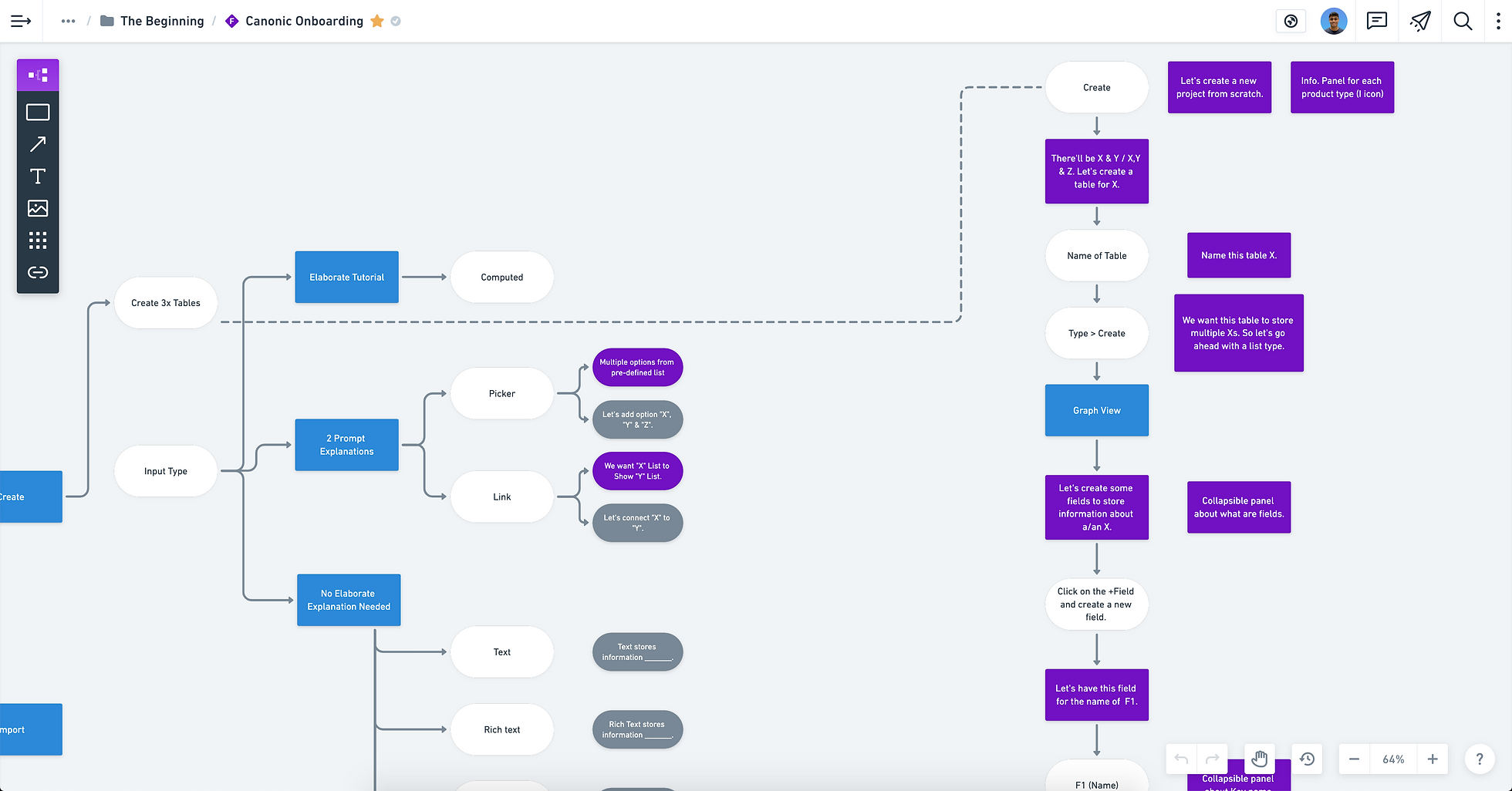
we noticed that it was difficult for people, irrespective of their programming experience, to build their first application on canonic. once they figured their way around the platform, they were able to adapt it to their specific use-cases. in fact, 83% of people never finished the onboarding and 75% of them dropped out after completing the first (out of three) stages. so, i focused a chunk of my time redesigning their onboarding experience.
problems:
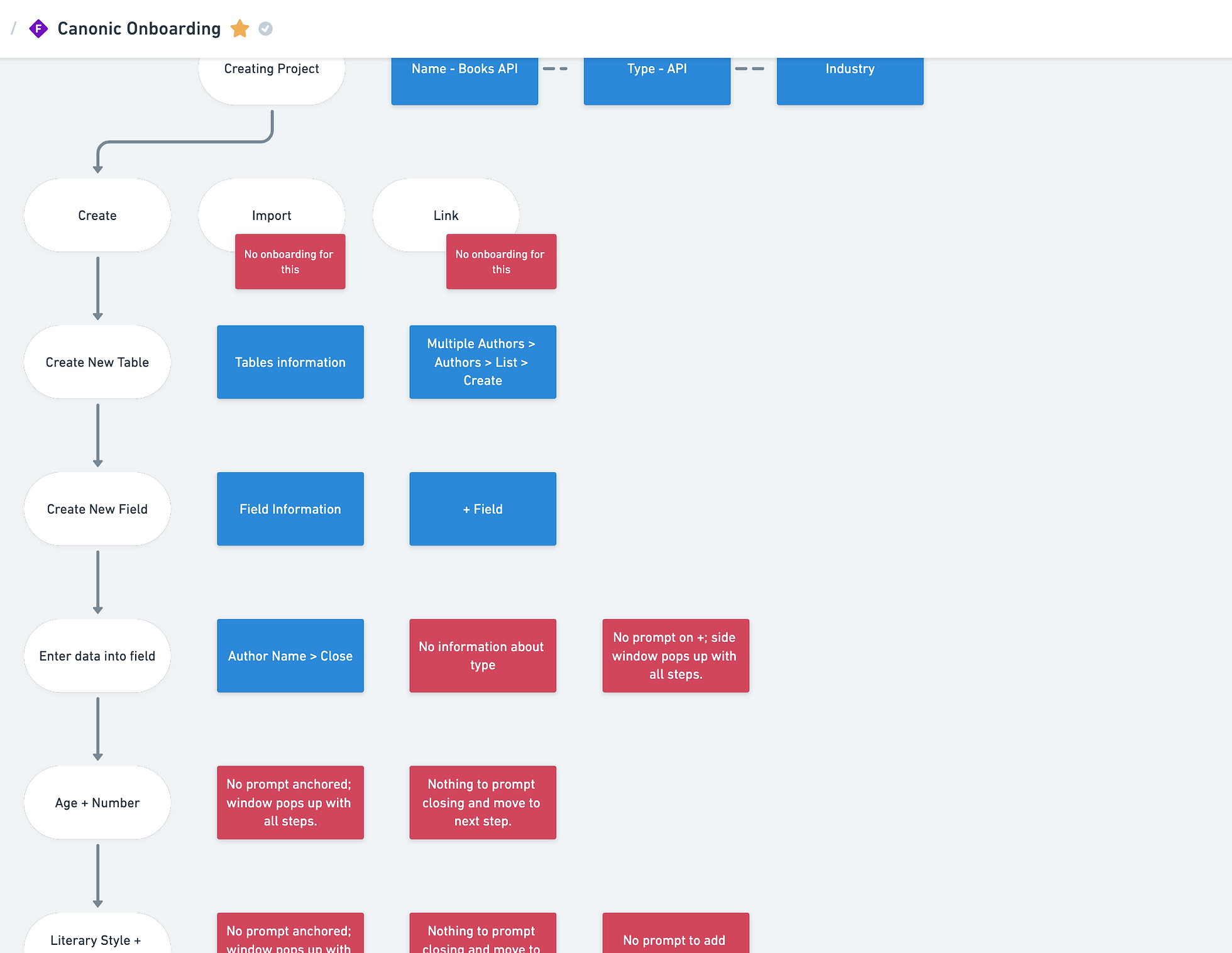
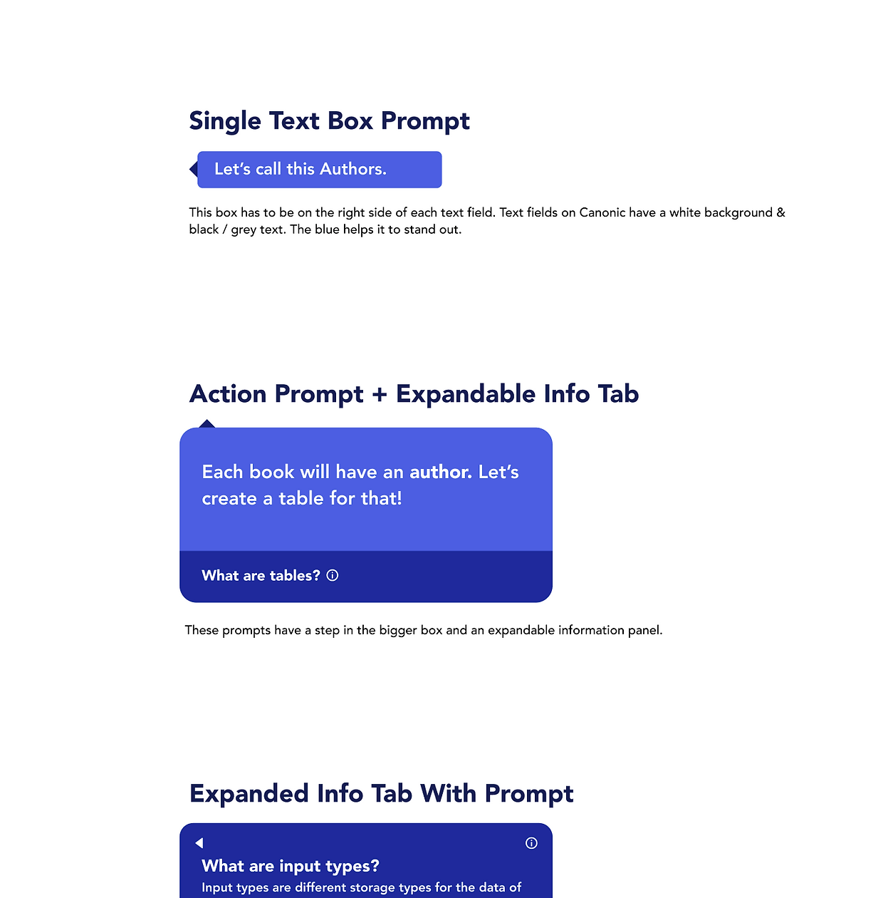
high cognitive load: the onboarding prompts often had irrelevant, lengthy explanations, and took a lot of time for people to comprehend. when i observed people going through the onboarding experience, many of them missed key information (since they skimmed through it quickly) and went on to make inaccurate choices later.
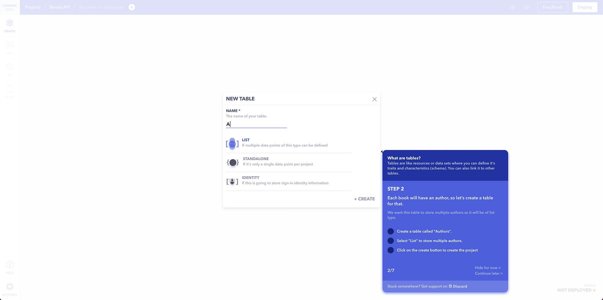
no intimation about errors: once they took an action that prevented them from going ahead, they couldn’t understand why. this also occurred when many steps were combined into one (such as entering a name, selecting a type and clicking on a button), and their error would have been on the first step (but they would assume it was on the last).
generalisation: a person, especially someone who wishes to use a tool to make something specific, wants to know how the tool will aid their process of creation. however, canonic made them choose between 3 projects, and asked them to learn the tool first, without considering their level of programming experience and what they wanted to ultimately build with the tool. the limited list of ‘mock-projects’ deterred people, and they misestimated the scope of what canonic could help them build.
multiple dead ends: there were many cases where a person may arrive at a dead end in the onboarding flow, unable to figure out how to progress ahead, and would quit instantly. when i studied the architecture, i realised that this was a possibility in almost all the steps.